
How can we empower
caregivers to help seniors?
Case Study • Mobile App Design • UX/UI Design
The Problem
One of health care’s biggest challenges in Canada is how to care for and support the aging population.
Studies show that when people age, they prefer to age at home or their child’s home. This puts pressure on family members who describe caregiving as “like a second job” and causes a high number to experience what health experts call “caregiver burnout.”
Personally, I could relate to this issue as I helped care for and managed both of my grandma's care and would also become the primary caregiver to my parents as they grow old and frail.
My Role
About Caren
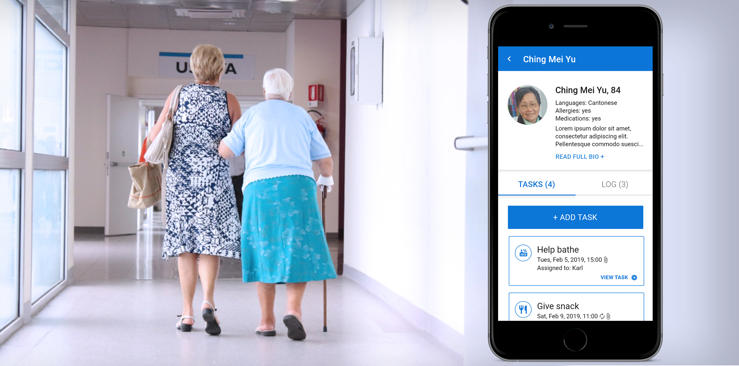
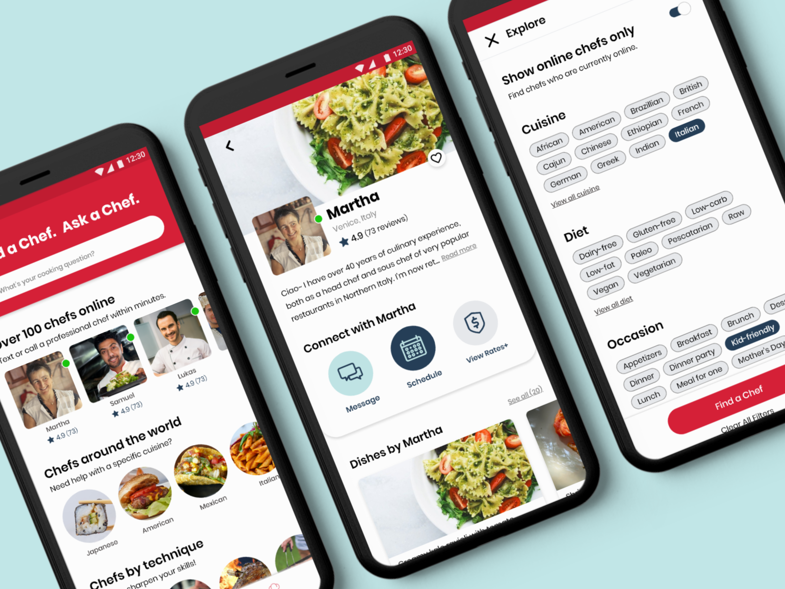
Caren is a seniors care app for caregivers. The app helps families manage the care of seniors living at home, by allowing users to create to-do lists and log updates, which can be shared with other family members or health care providers. Caren follows best practices in healthcare and recognizes that every senior and their family has a unique set of needs and preferences.
My Role
Having previously worked with Caren when it first conceptualized in 2016 during a hackathon, I was hired on as a UX/UI Designer in 2019 to give a fresh perspective and to make improvements to their existing app.
When I joined the team, there was already a beta version of the app in the Android and Apple app store. Caren's previous designer also conducted some usability tests a few months beforehand.
- Tools: Adobe XD, InDesign, Illustrator, Asana, Balsamiq
- Methods: card sorting, usability testing, user flow maps, prototyping
- Timeframe: January 2019 to July 2019
- Client: Caren App
- Team: CEO, Developers x2, Product Manager
The Process
Step 1: Understand
- Look through past documentation
- Intiate conversations with team
- Conduct research on the industry
Step 2: Define
- Further defining and addressing the problem
Step 3: Ideate & Design
- User flow diagrams
- Low-fidelity sketches
- High-fidelity mockups
- Component library
Step 4: Test
- Adobe XD prototypes
- Conduct usability testing
Conclusion
- Reflection
- Next steps
When I started at Caren, they already had an existing app. Instead of immediately jumping to make design changes and recommendations, I spent the first few days making sure I understood the needs of the company and their users.
My goals were to:
- Initiate discussions with the CEO, Developers, and Product Manager to get an overview of their workflow and how and why they come to their current product.
- Analyze past documentation such as meeting notes, quality assurance documents, group chat discussions, design files, articles, and the results of the last usability test.
- Familiarize myself with the industry by learning about caregiving and the aging population in Canada and the issues surrounding them.
To understand the company and the industry better, I looked through articles, past QA documents, past user research, and more.
Understanding the Users
While Caren is used to support the senior, it is important to note that seniors are not the users of the app. Rather, Caren is used by:
Family Members and
Friends of the Senior
Professional
Caregivers

Other Healthcare
Professionals
Key Findings
My conversations with the Caren team and analysis of past documents led to three main findings that I will further explore:
- Users were confused about the main features: The three main features of the app are the Bio, Task, and Log. However, users do not understand the purpose of some of these features.
- Users do not have the option to set recurring tasks: Users must set each task manually. Since research from professional caregivers indicate that many tasks are routine based, there is a need for recurring tasks.
- Tasks can be accidentally dismissed: The current layout of the Tasks screen makes it all too easy for a task to be accidentally dismissed, which can be detrimental to the senior's care. Also, there could be important information about the task that can only be read if the user clicks into it. However, there is no indication to the user that they could click into the task.
I took the findings and began to further define and address them by using a mix of various research techniques.
Addressing the Findings
#1) Users were confused about the app's core functionalities
Users did not understand the differences between the 'Bio' and Tasks' feature and were also not clear on what the 'Bio' feature is for.
Initially, I also did not feel like there is much of a difference between the two, so I could understand why users were confused. My first thought was to eliminate the 'Bio' feature as it felt unneccessary and having just 'Tasks' seemed straightforward and adequate enough.
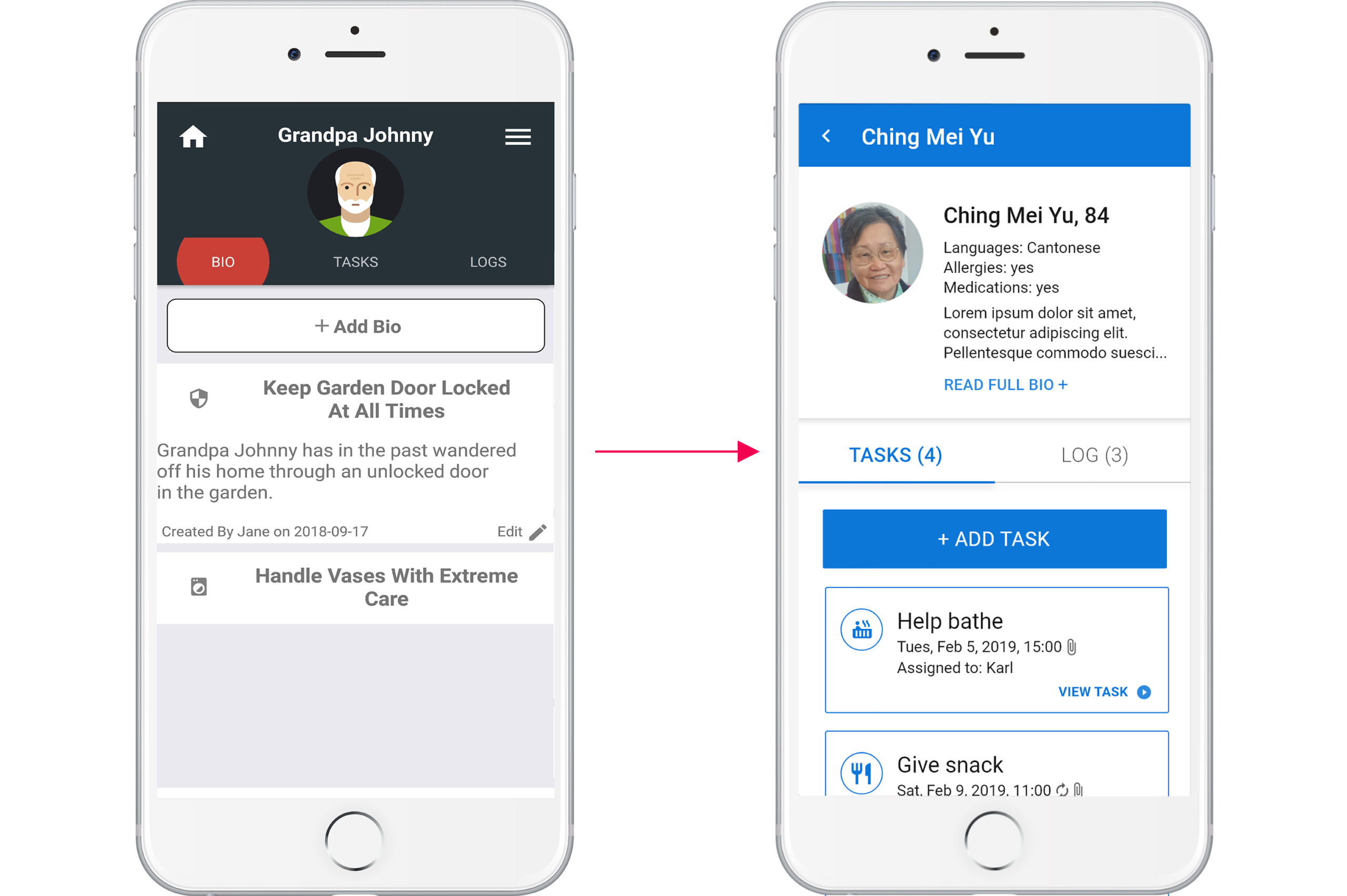
Below, I displayed the 'Bio' and 'Tasks' screens side by side to demonstrate why the two features seemed similiar.
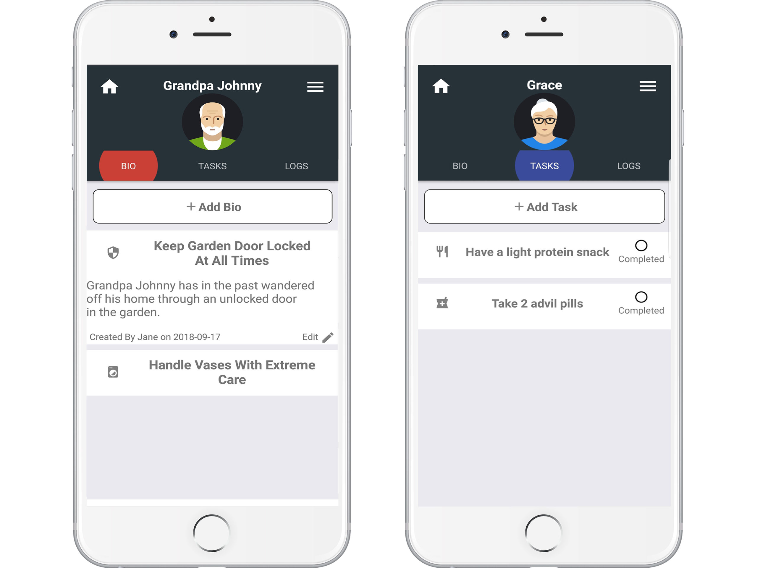
Users did not understand the difference between the 'Bio' and 'Tasks' features.
The 'Bio' acts like a Personal Health Record
I later learnt that the 'Bio' feature is a distinct feature that serves a very important purpose when it comes to the care of the senior.
Acting like a personal health record, the 'Bio' represents a common tool in caregiving called Activities of Daily Living (ADL) or Instrumental Activities of Daily Living (IADL). Both are used by professional caregivers to assess and manage a person's daily self-care activities.
In order to move forward with this project, I knew that I needed to have a better understanding of how ADLs and IADLs worked.
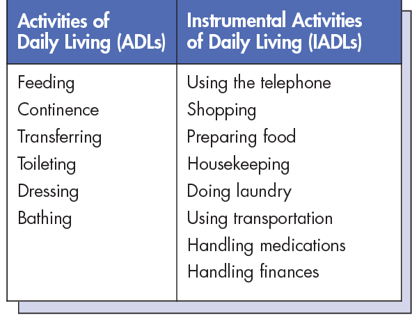
Example of ADLs and IADLs (Source)
Using Card Sorting to Understand Caregiving Tools
I researched online for ADL/IADL templates used by caregivers. Afterwards, I performed a closed card sort and organized the categories that would appear in an ADL/IADL, along with their subcategories. For example, a category would be 'Medication' while its subcategories would be 'Medication Type' or 'Medication Prep'.
For each subcategory, I noted down the different data types and indicated whether the data is structured or unstructured. Moving forward with the medication example, structured data would be the frequency or dosage needed, while unstructured data would be how the senior prefers to take the medication (i.e. with/without water, crushed, etc).
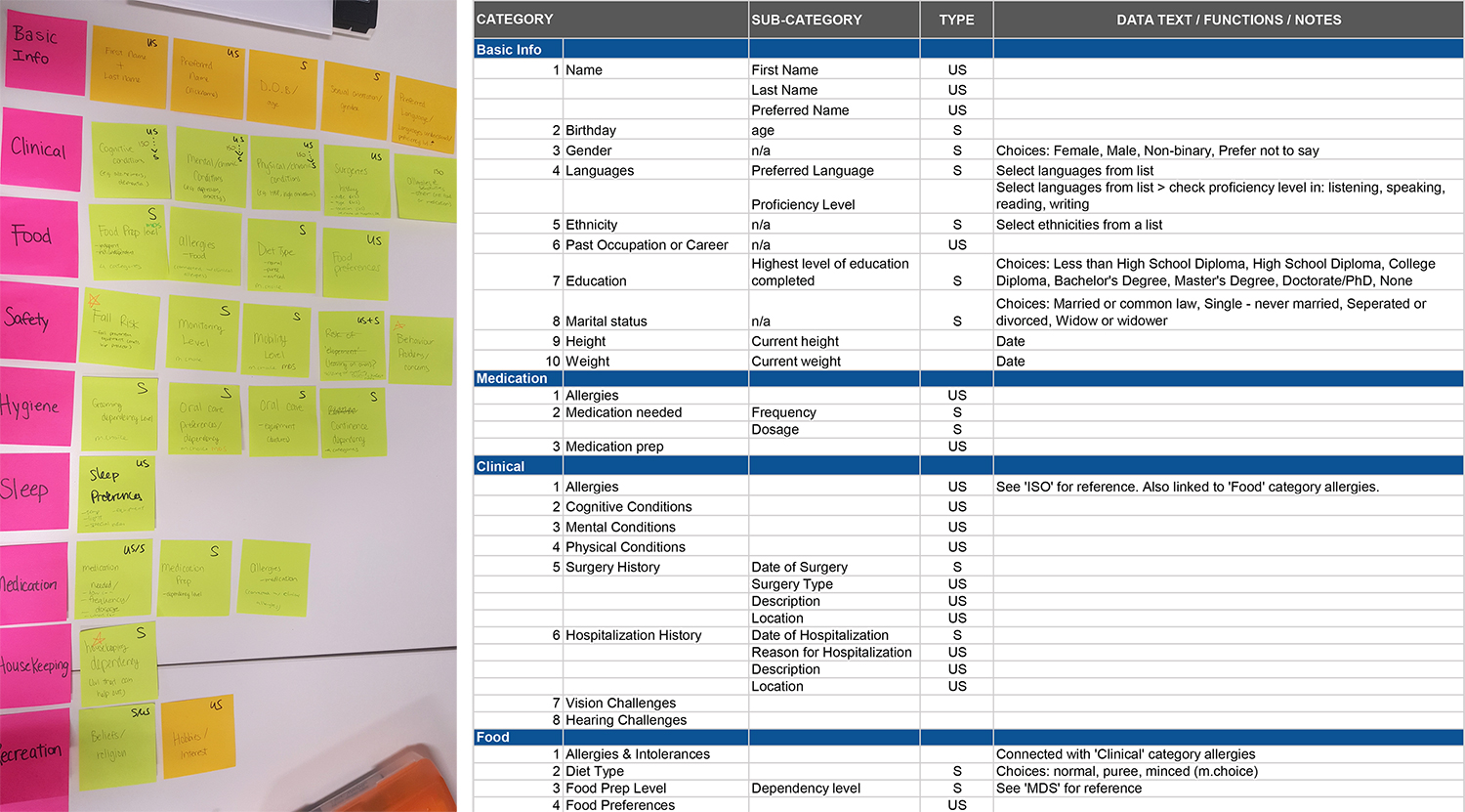
Card sort followed by organization of the information into a spreadsheet.
Conclusion
If, as a designer, I did not understand the purpose of the 'Bio' feature, then how could we expect our users to understand it?
Breaking down the categories helped me get a good understanding of why ADLs/IADLs are important to the care of the senior.
I knew from then on that there needs to be a better way to display the 'Bio' so its purpose is clear to the user.
#2) Users do not have the option of setting recurring tasks
Research from caregivers indicates that many tasks are routine based, so there is a need for users to be able to set recurring tasks. However, Caren's beta app only allows users to set each task manually.
I began to research other apps that has a reoccuring task or event feature to get an idea of the common elements and interactions that can occur when creating a recurring item.
Conclusion
After looking through many apps, I found that Google Calendar does a thorough job in providing the user with multiple different ways when creating a recurring event.
It was important to allow flexibility and convenience for our users so I included options to be able to repeat a task daily, weekly, monthly, or yearly, as well as to set an end time.
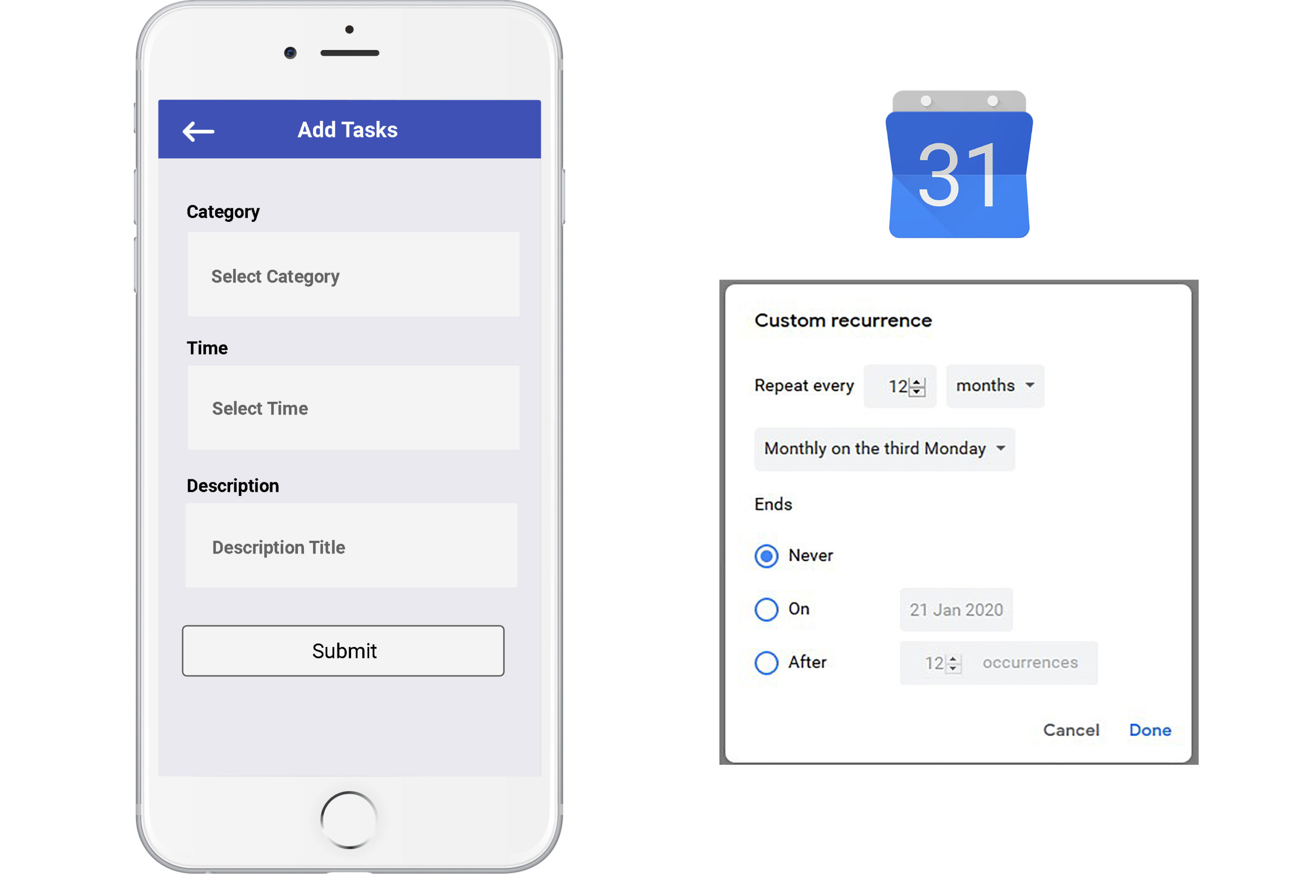
Left: Caren's beta app does not allow users to set recurring tasks.
Right: Google Calendar offers their users many options for reoccuring events.
#3) Tasks can be easily and accidentally dismissed
A task is marked as completed once the user checks the ‘completed’ checkbox. This makes it too easy for users to accidentally dismiss a task, which can be detrimental to the care of the senior.
Additionally, sometimes there is important information about the task that can only be read if the user clicks into the task. However, there is no indication of this to the user, which can also be detrimental.
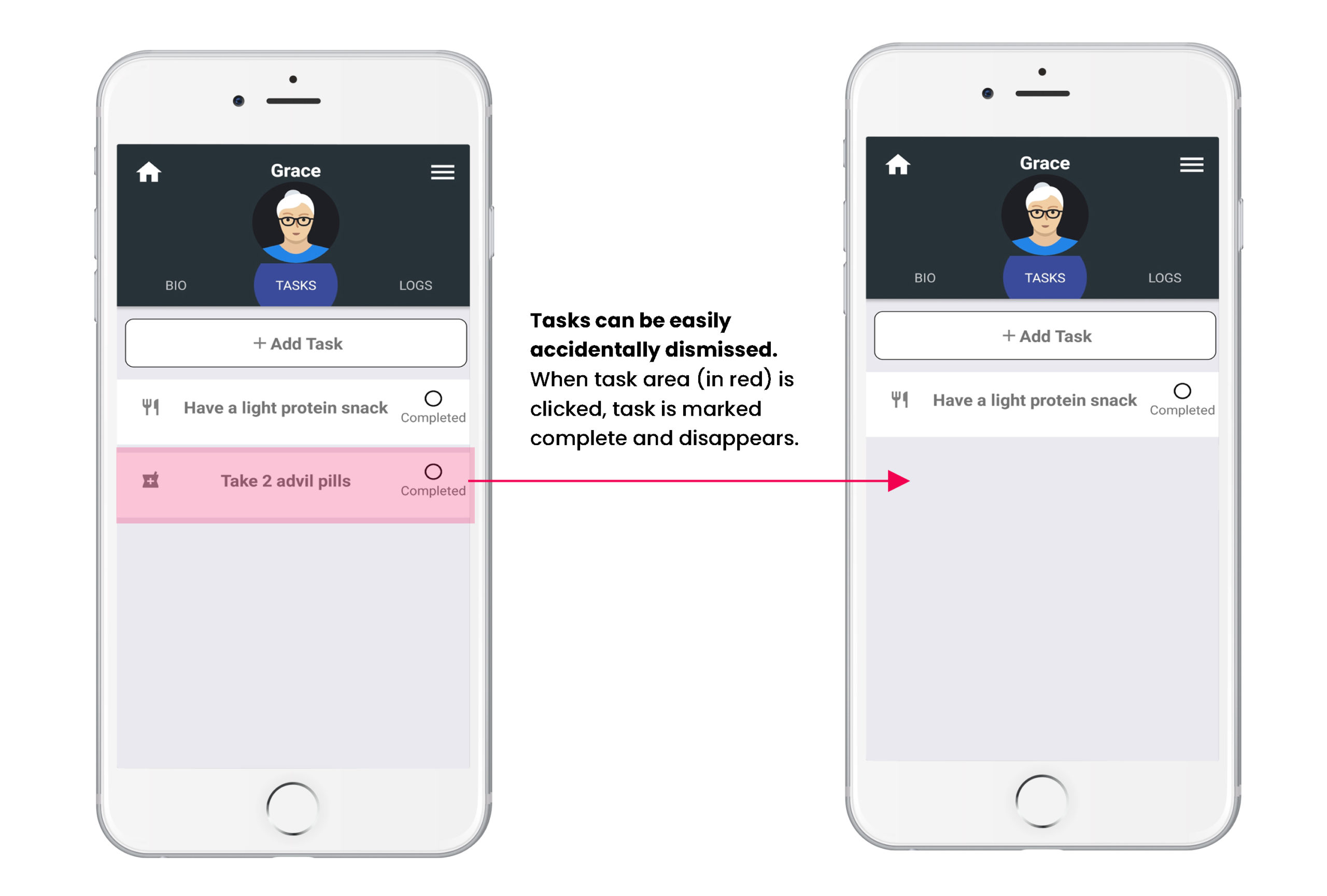
Tasks can be easily accidentally dismissed on Caren's beta app.
Also, users are unaware that they can find out specific directions about the task if they click into it.
Conclusion
To make sense of what type of information should be displayed in a task, I conducted a content hierachy. First, I broke down the content into two parts:
- The task when viewed as a list (list view)
- The information that the user sees when clicked into a task (single task view)
I then jotted down what type of information should be in which view and in what order.
List View:
- Task category
- Task name
- Task completion date
- Who the task is assigned to
- Button for users to click into task for more information
Single Task View:
- Items in previous view (category, name, completion date, task assignee)
- Ability to input notes or specific instruction about the task
- Uploading photo/media function
- Completion buttons for the caregiver to confirm whether the task gets completed
Finally, I created low-fidelity wireframes of the two views using Balsamiq.
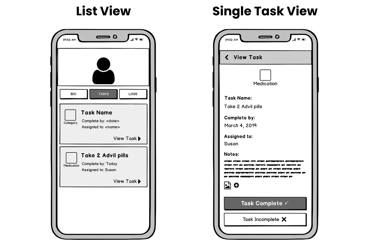
Lo-fidelity wireframe of the List View and Single Task View.
Key Findings
I expanded on my research based on the initial findings and further defined them, giving me attainable next steps to move forward with the project.
- The ‘Bio’ feature acts like a personal health record for the senior. There needs to be a better way to display the 'Bio' Feature so the purpose is obvious to the user.
- After looking at many examples of apps that have recurring events, I decided to base Caren’s recurring task feature on Google Calendar, which offers their users many options when it comes to setting recurring events.
- It is easy for users to accidentally dismiss a task or to not read further task instructions, which can be detrimental to the senior. I used content hierarchy to prioritize the content and created low-fidelity wireframes to show how the content could be displayed.
Progression of the User Flow
Early on, I started mapping out Caren's user flow, which evolved during the course of the project.
The user flow maps were helpful not only for myself, but also to my team, as it gave us a clear reference point to explain design changes and also gave us a high-level overview of the multiple ways users can interact with the app.
Below are screenshots of the map during the beta phase and by the end of the project.
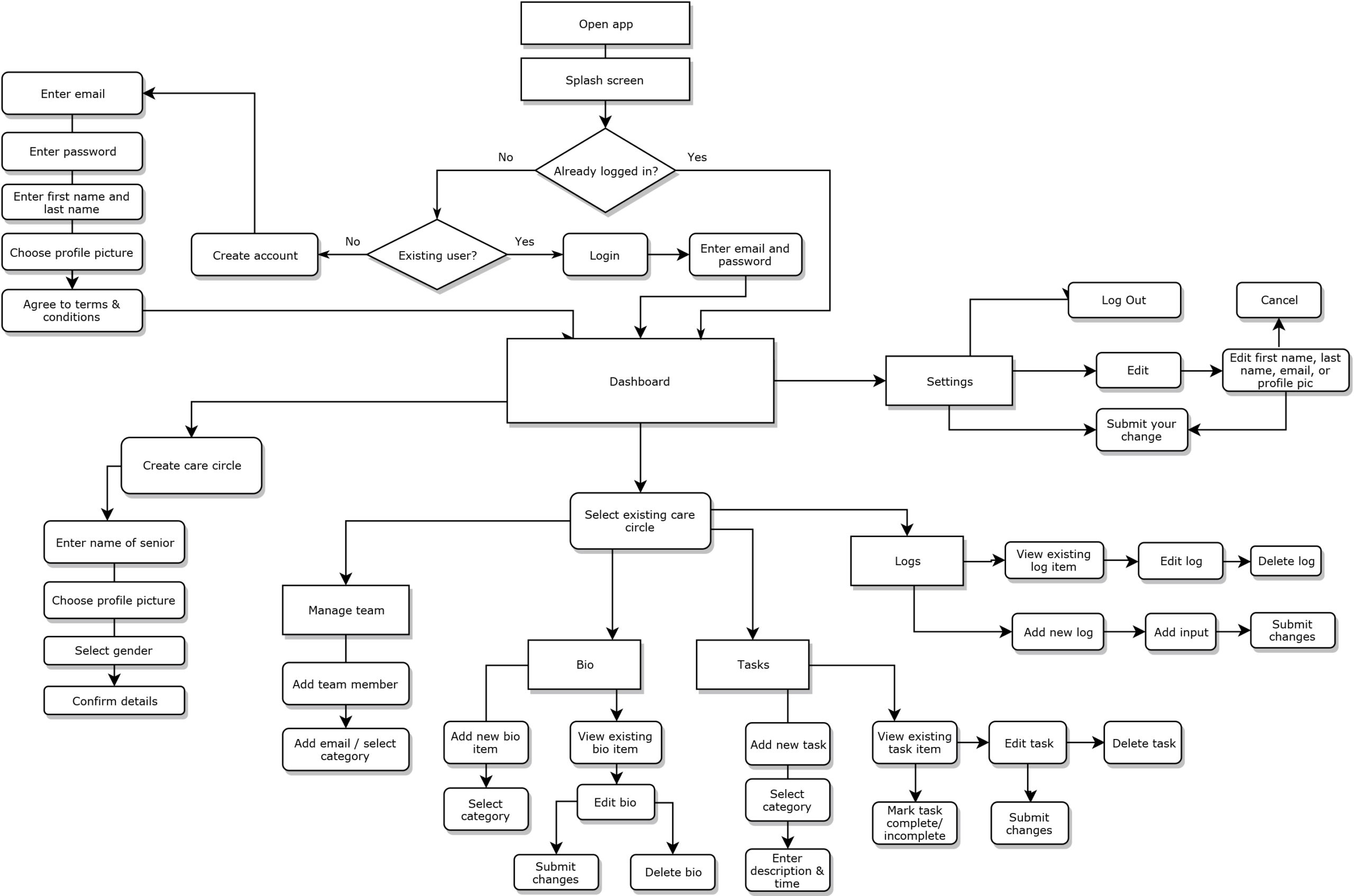
Before: user flow of beta version of Caren app
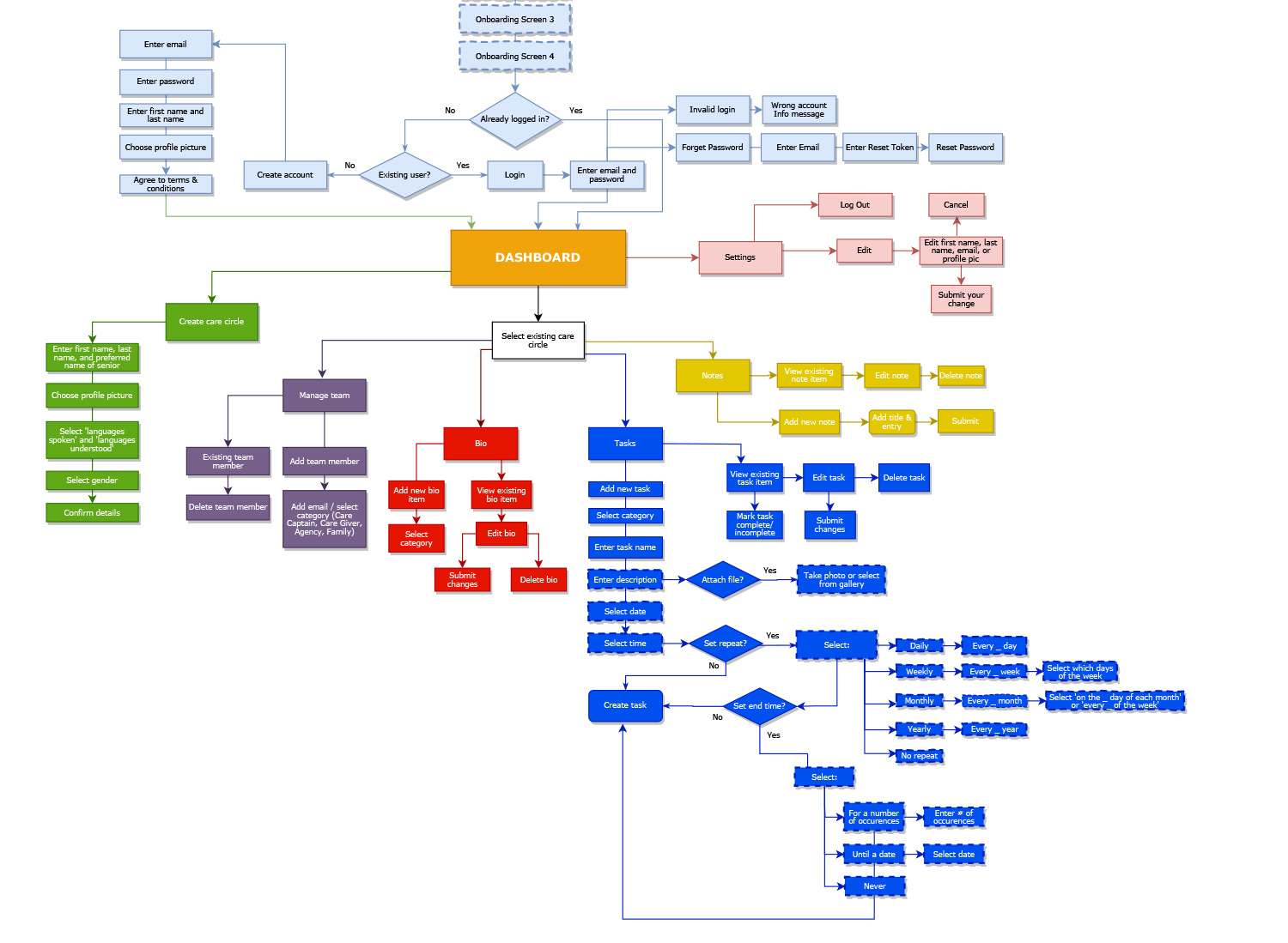
After: Final version of our userflow. Each section is seperated by colour for easier viewing.
Low-Fidelity Sketches
I also began the idea generation process by putting pen to paper with low-fidelity sketches. Below are just a sample of the many sketches and notes I did.
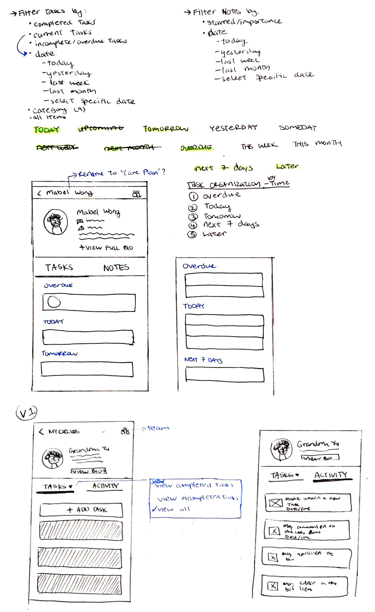
Sketches of a new dashboard design that displays the 'Bio' feature in a distinct area.
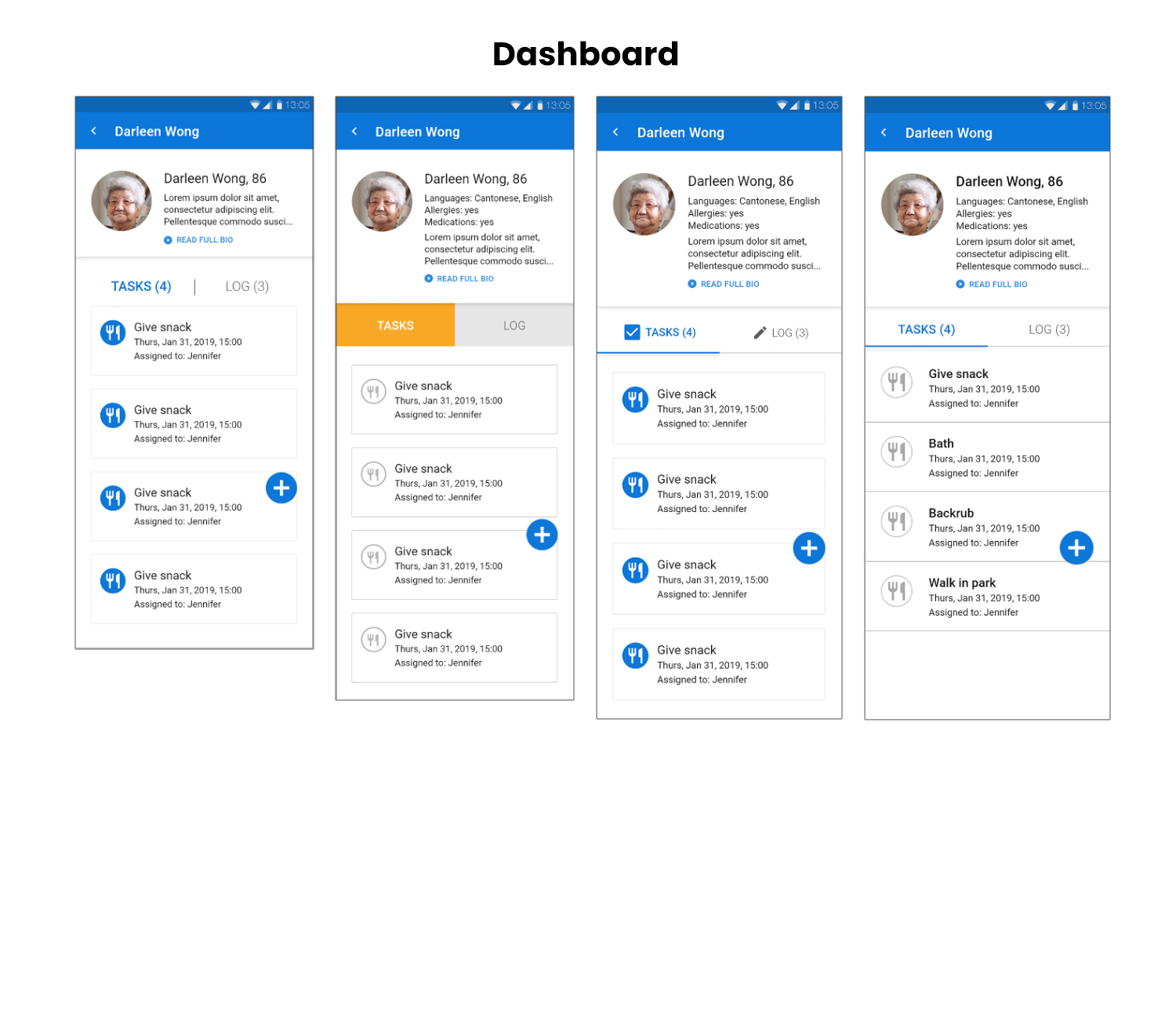
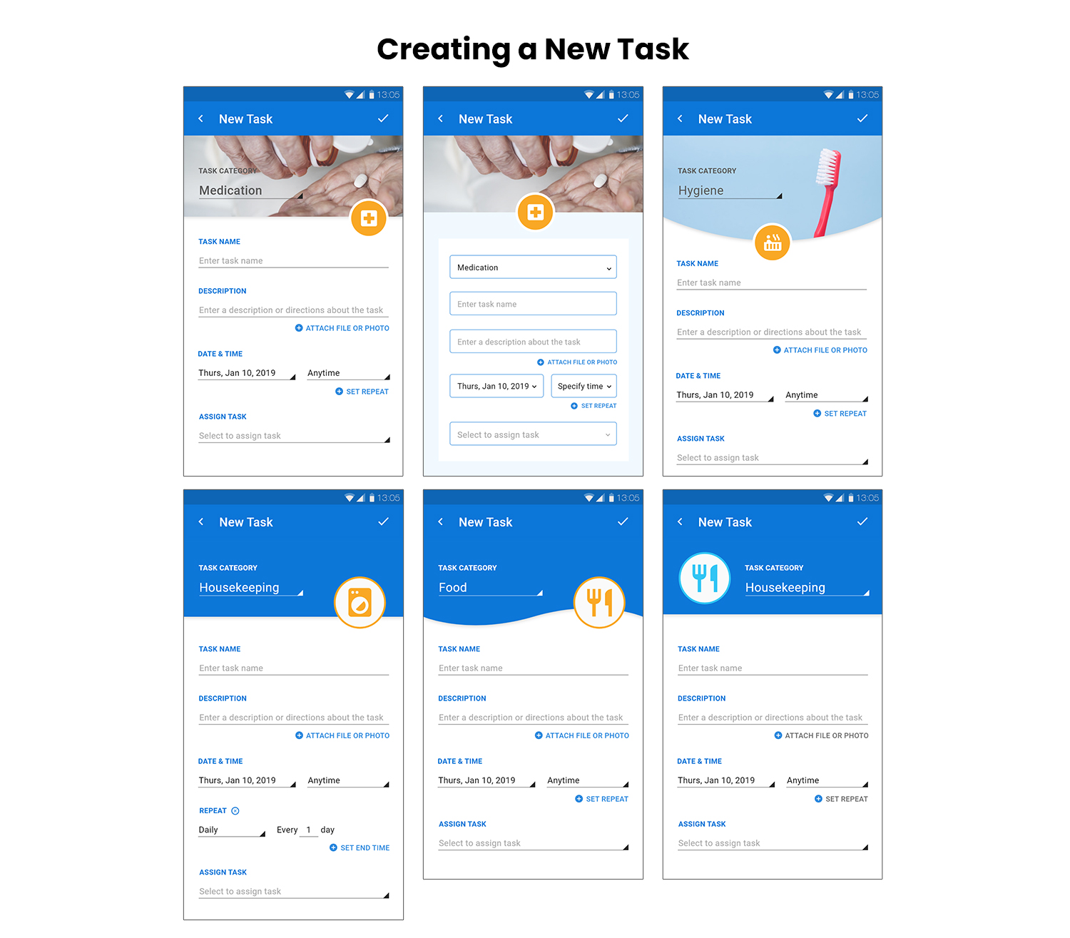
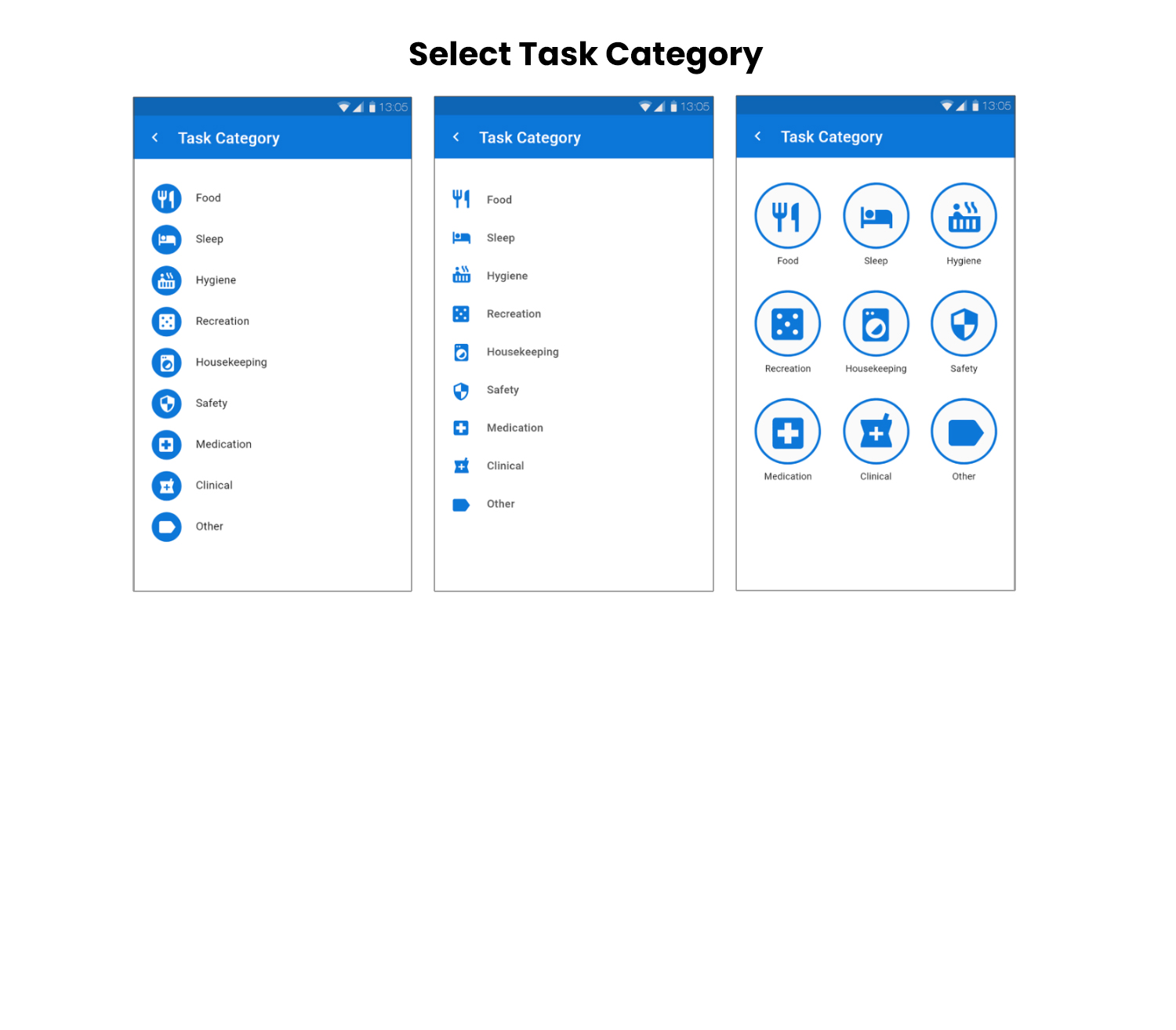
High-Fidelity Mockups
I then moved on to high-fidelity mockups and created multiple versions of various screens. Below are some of the mockups for:
- Creating a New Task
- Dashboard
- Selecting a Task Category
Component Library
Seeing as I was essentially working on a redesign of the UI, I began to create a component library. Just like the user flow maps, the component library evolved throughout the course of the project.
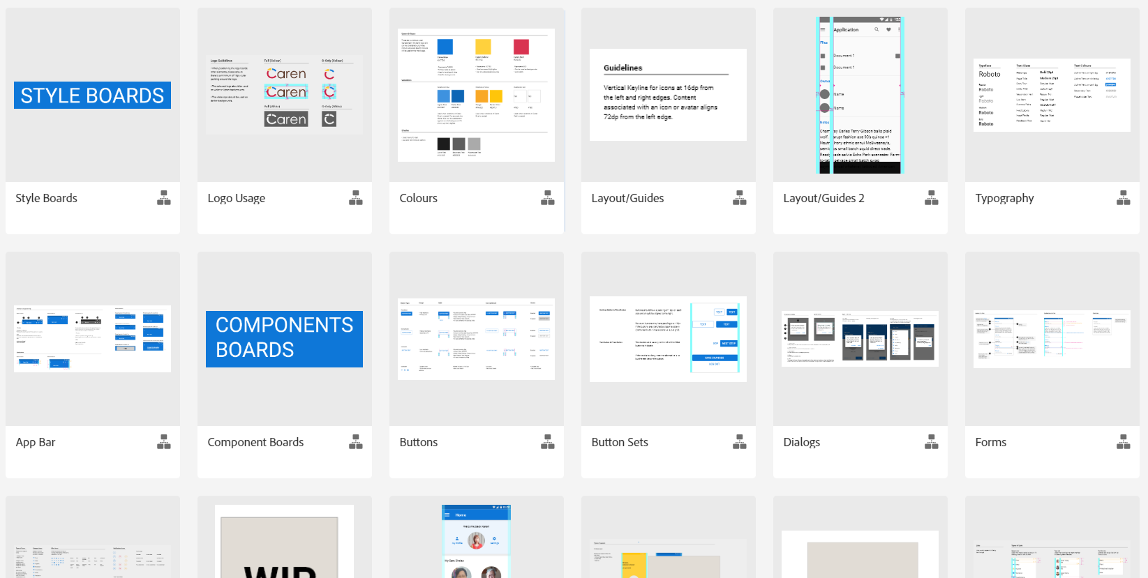
Screenshot of Caren's component library.
Key Findings
- Starting with low-fidelity sketches, I redesigned the layout of the ‘Bio’ feature to differentiate it from the 'Tasks' and 'Log' feature.
- Using high-fidelity mockups, I played around with variations of layout when it came to screens such as: Creating a New Task, the Dashboard, and Selecting a Task Category.
- The new Dashboard mockups also prevented the user from dismissing a task before it is completed since it prompts the user to click into the task in order to mark it complete.
- User flow maps and a component library was continuously iterated upon throughout the project and was helpful in communicating design ideas and keeping consistency.
I put the new designs and prototypes to the test by conducting usability testing with five participants.
The main goals are:
- Users should be able to understand that there are three main features (Bio, Tasks, and Log).
- Users should understand the purpose of each feature.
- Users should not be able to dismiss a task without viewing it first.
- Users should be able to view and understand the components of a task.
- Users should be able to create a task without difficulty, including using the recurring feature.
Scenarios and Tasks
Each participant was given a scenario and asked to perform a series of tasks. Below, I included a few examples of the tasks.
Scenario: You’ve just downloaded an app called Caren to help care for your aging loved ones such as your parents or grandparents.
Tasks:
- Do you use your mobile device to stay in touch with family?
- What does the day to day caretaking for your elderly family members look like, if any?
- How would you use this dashboard?
- Take a look at the task where it says 'Give snack'. Based on the information you see here, what can you tell me about this task?
- If you were unable to complete the task, where would you go next?
- Did you expect that to happen? / What do you think just happened?
- What do you expect to see if you go into the 'Bio'?
- Take a look at the 'Log' tab. Can you tell me what you think you can do here?
- You want to create a new task item related to hygiene. Which sections would you utilize?
Adobe XD Prototypes
Below are the prototypes that was used during usability testing.
Navigating the Dashboard
Interact with the prototype below or click here to view the Dashboard prototype on a different browser.
Create a New Task
Interact with the prototype below or click here to view the Task Creation prototype on a different browser.
Test Results & Insights
After the usability tests, I compiled all the results together into an Excel sheet and conducted an analysis of the findings to form insights. Below is a screenshot of my work process.
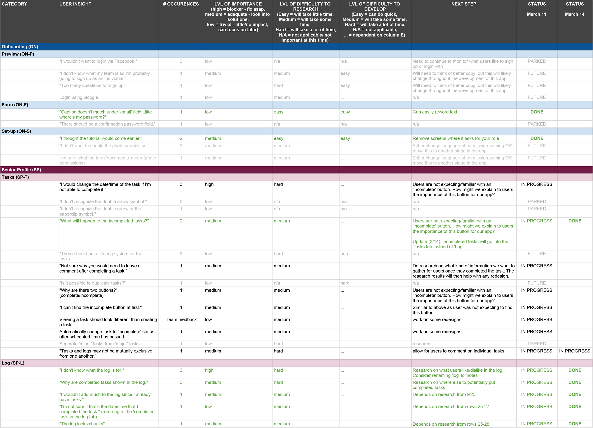
Screenshot of usability test findings and insights.
Users understood the purpose of the 'Bio' feature.
In the beta app, users did not understand the purpose of the 'Bio'. In the new prototype, I asked users to take a look at the dashboard and tell me what they think they will find in the 'Bio' feature. 100% of the participants understood the purpose of the 'Bio' as proven by their responses.
"I want to see her address, her birthday, her CareCard number, medications, allergies...maybe things like the time she goes to bed or time she eats lunch..."
"I expect to see a list of allergies, medications, number of times the senior needs to take the medication, a list of health conditions..."
"I expect to see the patient medical history and background."
With the new placement of the 'Bio' feature, it is clear to users what to expect.
Users were confused by the 'Log' feature.
Users were confused by the Log feature and find it unnecessary. In the prototype, completed tasks goes into the Log and users were surprised by that.
"I wouldn't add much to the log since I already have Tasks."
"Why are completed tasks shown in the log?"
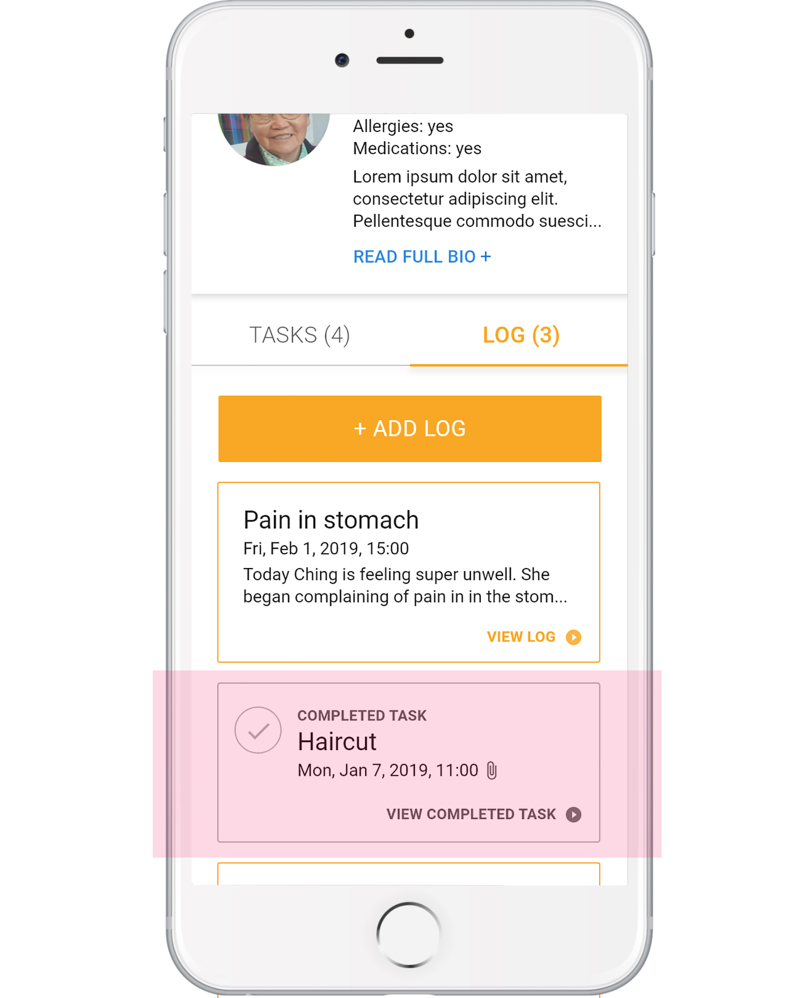
Users did not understand the 'Log' feature.
Confusing Interactions when Viewing a Task
Users experienced some difficulties when viewing an existing task. They were confused on why there is a 'Complete' and 'Incomplete' button and when 'Completed' is clicked on, they were confused as to why they need to leave comments.
"Why are there two buttons? Why not just the 'Complete' button?"
"Not sure why you would need to leave a comment after completing a task."
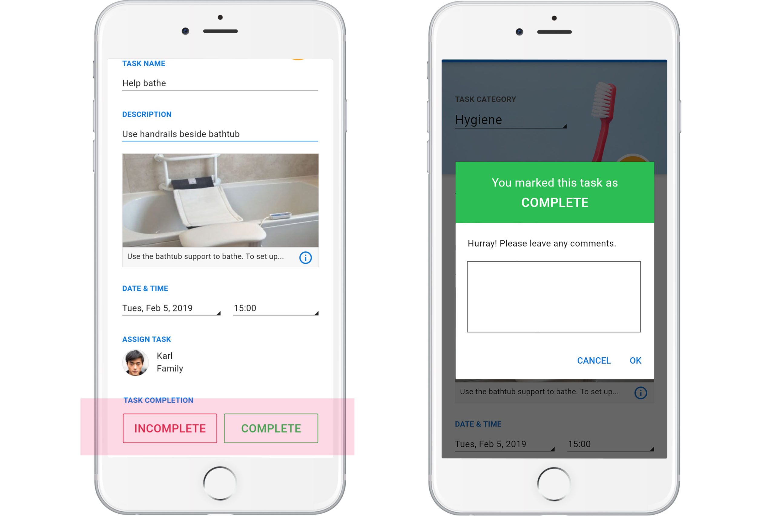
When viewing a task, users were confused by the Incomplete/Complete buttons and the comment box.
Users Expected to See a 'Create Task' Button
When creating a task, users expected to see a 'Create Task' button at the bottom of the screen. In the prototype, users had to click a checkmark at the top right corner of the screen to create the task.
"I think there should be a button at the bottom."
"I don't know what to do next...there's no button."
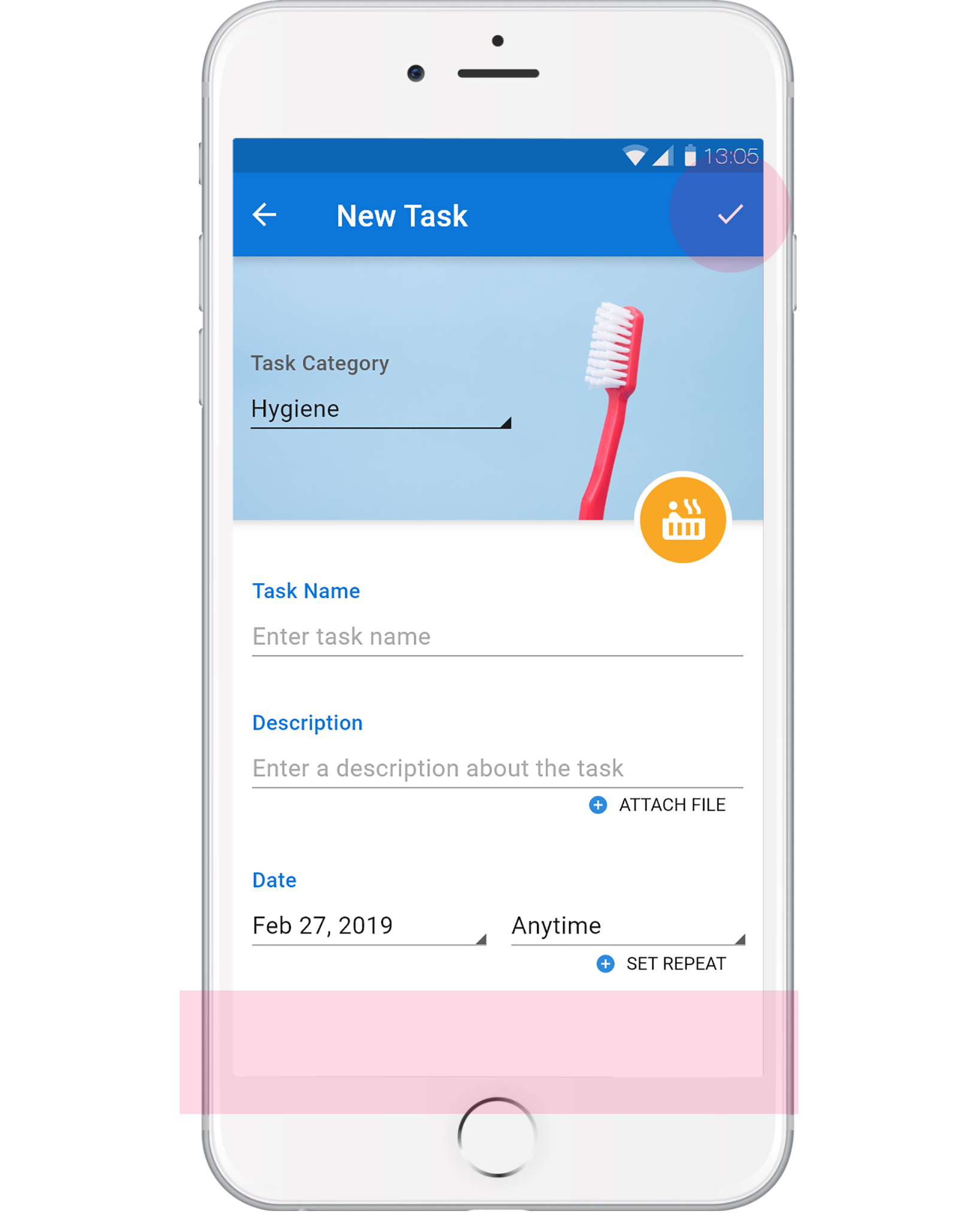
Users expected to find a 'Create Task' button at the bottom of the screen.
Instead, they only had the checkmark icon.
Were the Goals Achieved?
So, what happened?
| Goal | Achieved? | Potential Solutions |
| Users understood that there are 3 main features (Bio, Tasks, Logs). | Yes - It was clear to users that Caren has 3 main features when viewing the dashboard. | |
| Users understood the purpose of each feature. | Almost - One feature (Logs) was found to be confusing for users. | Changing the title from 'Logs' to 'Notes' as it is more self-explanatory. |
| Users should not be able to dismiss a task without viewing it first. | Yes - In order to mark a task as 'Complete', users had to click into the task first. Each task in the task list also has a 'View Task' button, which encourages the user to click into it. | |
| Users should be able to view and understand the components of a task. | No - Users were confused by the 'Complete' and 'Incomplete' buttons at the bottom of the screen. Users did not understand why they were prompted to leave a comment after completing a task. |
Rethink layout for the 'Complete'/'Incomplete' buttons so it makes more sense to the user. Remove comment feature as this may be too cumbersome and also took away from the 'Log' feature. |
| Users should be able to create a task without difficulty, including using the recurring task feature. | Almost - Users expected to find a 'Create Task' button at the bottom of the screen. | Add 'Create Task' button at the bottom of the screen. |
Key Findings
- The new prototypes were effective in helping users understand the bio feature and to not accidentally dismiss a task, which were issues that Caren’s beta app had.
- New issues were identified including confusion with the Log feature and confusion with marking a task as complete or incomplete.
- I have proposed some solutions to the new issues. Further testing would be helpful in testing these solutions.
Reflection
The Importance of Understanding the Industry
When I started at Caren, I was eager to make changes to improve their existing app. So, when I read that users were confused by the app's 'Bio' feature, my first thought was to discard the feature, especially since 'Tasks' seemed sufficient enough. However, I later learnt the importance of this feature after I did more research on how caregiving works in Canada. It would have been a huge mistake to disregard the 'Bio' and would have brought upon many issues moving forward. This was a lesson learned on why it is important to do research first and understand the industry.
What would I have done differently?
When you work on a project that already has an existing product, you have to put on a different mindset and really do your part to understand why things are the way they are. So, when I caught myselt trying to perfect the UI too early on, or to 'solutionize', I had to remind myself to stay patient and user focused. If I were to do this project again, I would stop myself from 'solutionizing' too much. This also resulted in me having way too many design files!
Next Steps
By the time I left Caren, the Development team was working on coding the component library with the hope of eventually replacing the beta app with the new designs. However, this did not pan out as Caren stopped its operation about one year in after I left. Nevertheless, I was grateful for the opportunity to work at Caren and became a better UX/UI designer.
Featured Projects
Hi, my name is Kelly and I'm a UX/UI designer in Vancouver, Canada.
I advocate for users while helping organizations achieve their goals with strategic thinking.
Like what you see?
© Kelly Choi 2023