Keeping seniors engaged in an online game during the COVID-19 pandemic
The Problem
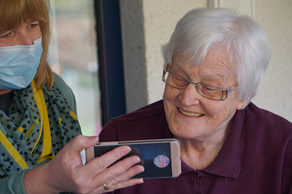
Due to the COVID-19 pandemic, many people are facing physical isolation which is detrimental to their mental health and wellbeing. While online tools and games have been a popular way for people to connect and engage with each other, many seniors lack the digital literacy skills to do so.
Connected Canadians wants to design an easily accessible game that seniors can play to stay socially connected. While online pictionary games exists, we found that they are not ideal for seniors who do not have high comfort level in technology. Thus, the goal is to create a video-based immersive social gaming platform that is senior-friendly.
The Project
About Connected Canadians
Connected Canadians is a non-profit organization that promotes digital literacy skills to seniors and older adults by providing technology training and support. Connected Canadians offers a combination of programs such as one-on-one support, instructor-led workshops, and web-based resources.
My Role
I joined the Connected Canadians team as a volunteer UX/UI designer through the Help with COVID website.
- Timeframe: March 2020 - September 2020 (design and research phase). Development of the game is currently ongoing.
- Tools & Techniques: Adobe Creative Suite, user testing, user flow mapping, Balsamiq
- Team: The founders of Connected Canadians, volunteer developers, and 1 other volunteer designer
The Process
Step 1: Understand & Define
- Understanding the users
- Gather initial requirements
Step 2: Ideate & Design
- User flow diagrams
- Low-fidelity sketches
- Style Guide
Step 3: Further Testing & Iteration
- High-fidelity mockups
- Iteration, iteration, iteration
Conclusion
- Reflection
- Next steps
When I joined Connected Canadians, the game was in the conceptual and research stage.
The Connected Canadians team had already spent a few sessions where they played Skribbl, a popular online pictionary game, with seniors. In addition, countless hours had been spent interacting with seniors through the organization's various programs and initiatives. This was valuable information for me as it meant that there was already user feedback to work from and I also would be able to get a better understanding of the users.
First User Test
In addition to the user feedback I already received, I was also able to participate in a user study with seniors. I played a game of Skribbl with a small group of seniors alongside a few people from the Connected Canadians team. The idea is that we would be able to see and talk to each other via Zoom on one screen, and play the game with each other on another screen.
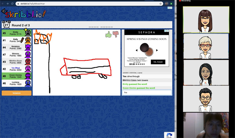
A common set-up while playing online games. The game is visible on one window or screen while a video set-up is on another window or screen. To protect the privacy of our senior users, I blurred out their names and replaced their images with bitmojis.
Through this user test, I was able to see the pain points that was experienced by the senior players. Though these pain points were mentioned to me by the founders when I first started the project, seeing it 'in person' helped me become more empathetic with the challenges many seniors face when it comes to technology.
The challenges and observations included:
- People ending up on the wrong website instead of the Skribble website
- Not knowing where to enter their player name
- People didn't make their own avatars (On Skribbl, you can customize your game avatar)
- Unaware that there were hints when trying to guess the word
- Not being able to find the color palette or eraser when it was their turn to draw
- When it is your turn to draw, Skribbl provides an option of 3 words, but people didn't know how to pick the word so it was randomly assigned to them which frustrated them.
- Seniors found the dual task of using Zoom and Skribbl at the same time difficult.
- The ads were distracting and confusing to users.
Gathering Initial Requirements
With these observations in mind, I began to gather the initial requirements for our game. I wanted to know what features we should have in our game which meant that I need to think about pictionary from a research perspective rather than a player perspective.
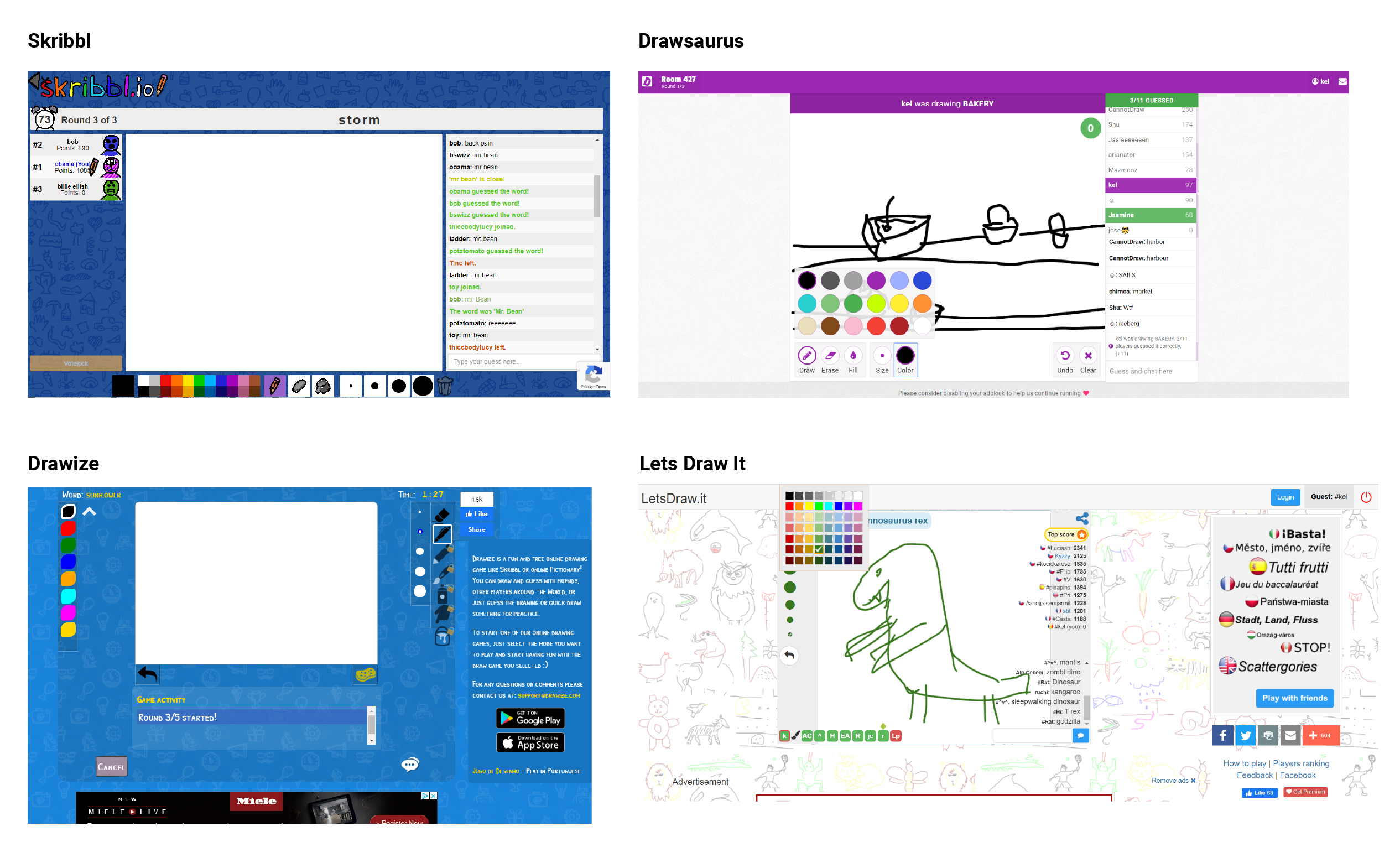
I looked up a few popular online pictionary websites and joined a few games from the following:
- Skribbl
- Drawize
- Drawasaurus
- Lets Draw It
While playing, I took notes and screenshots to see the differences and similiarities in features and UI.
Through this exercise, I came to realize that there are so many features and flows to consider within a game that I admittedly previously never really thought about. For example, below are some of the questions I began to ask myself in preparation for the design of our game.
- How long should the timer be for each round? Should there be a timer?
- What should happen in the pre-game room? Would our users know that it is a pre-game room?
- How can we make it easy for users to create and share a game?
- How can we make the hint easy for the users to spot?
- What should happen during the 'in-between' states? For example, at the end of a drawing turn or or the start of a new round
- What is the max and min number of players there should be for each game?
- What other pages should there be on the game website?
I took the initial observations and requirements and began the ideation and design phase.
Progression of the User Flow
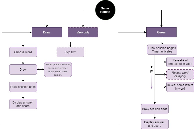
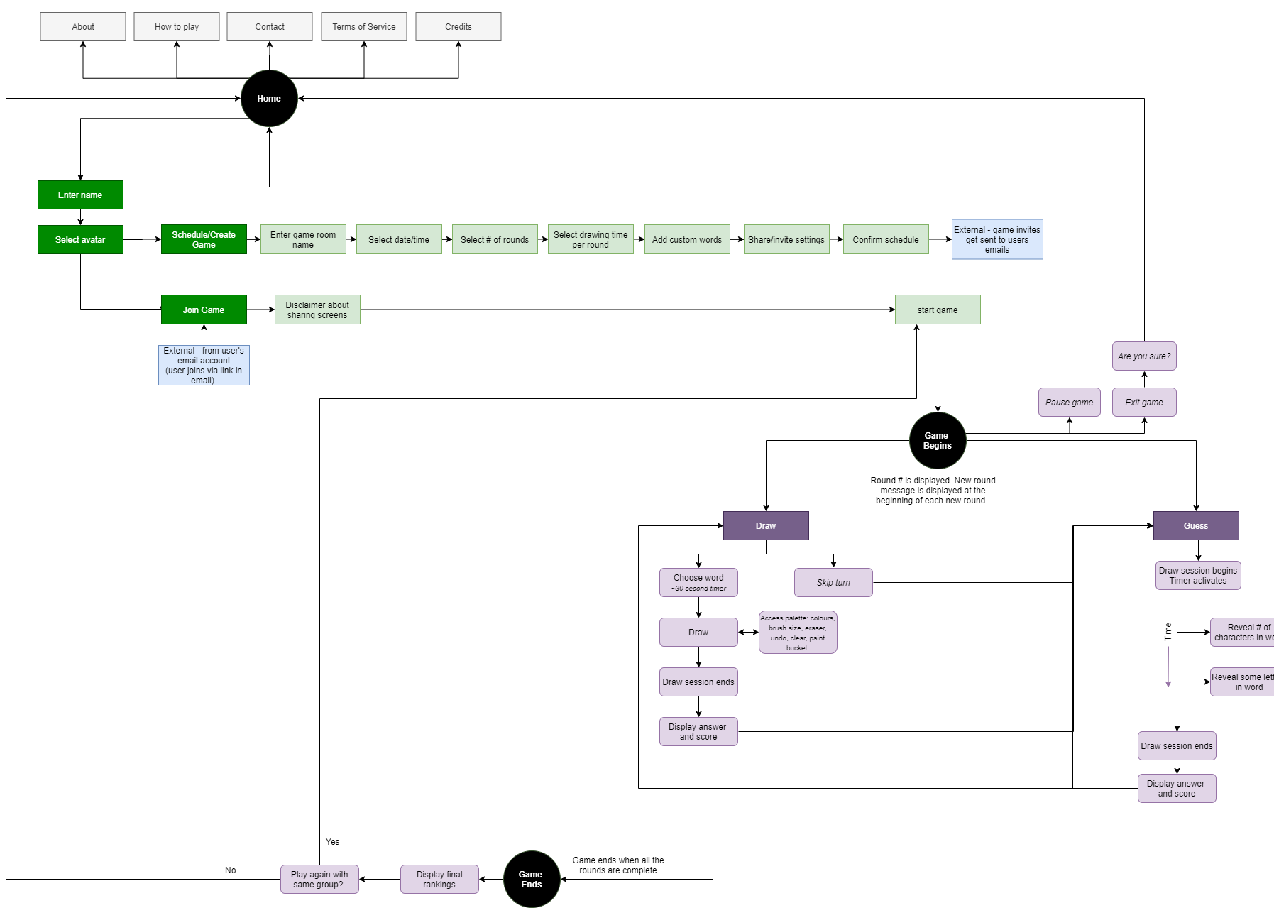
I created a user flow diagram early on in the project which evolved over the course of the project. This was helpful especially since a game has so many possible user flows. It was helpful to have a visual to see all the connections at a glance.
Below are screenshots of the user flow diagram during the earlier stage and latest stage of the project.
Before: user flow digram that was created during the beginning of the project
Low-Fidelity Sketches
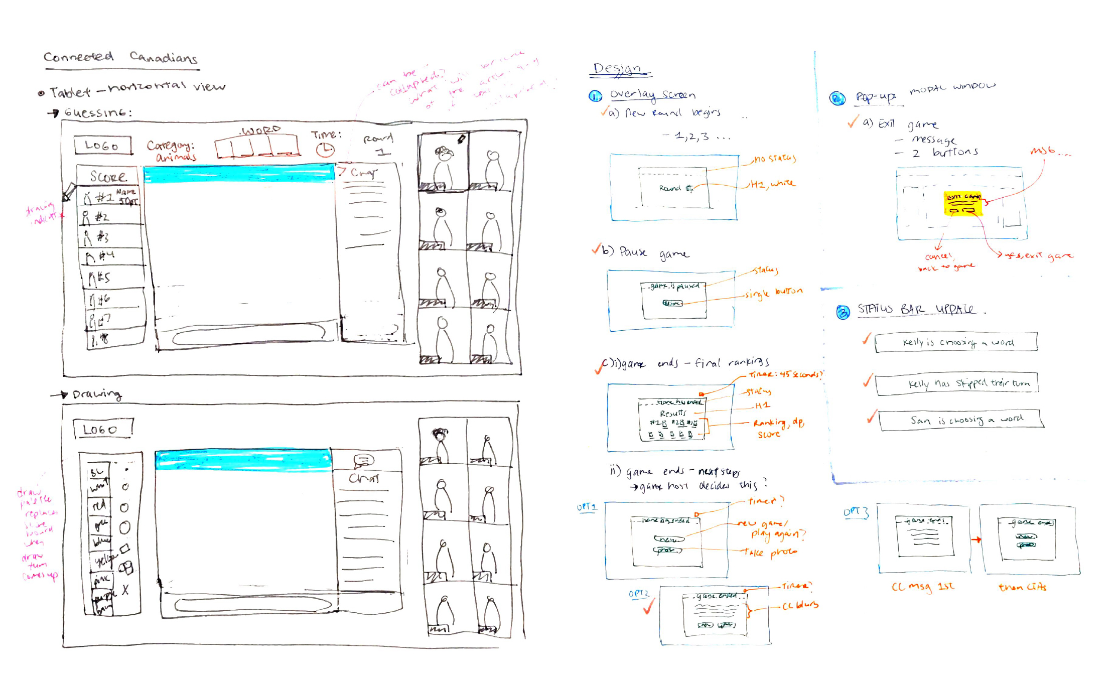
I like to get my initial ideas out by pen and paper. Below are just a sample of the many sketches and notes I did.
Low-Fidelity Mockups
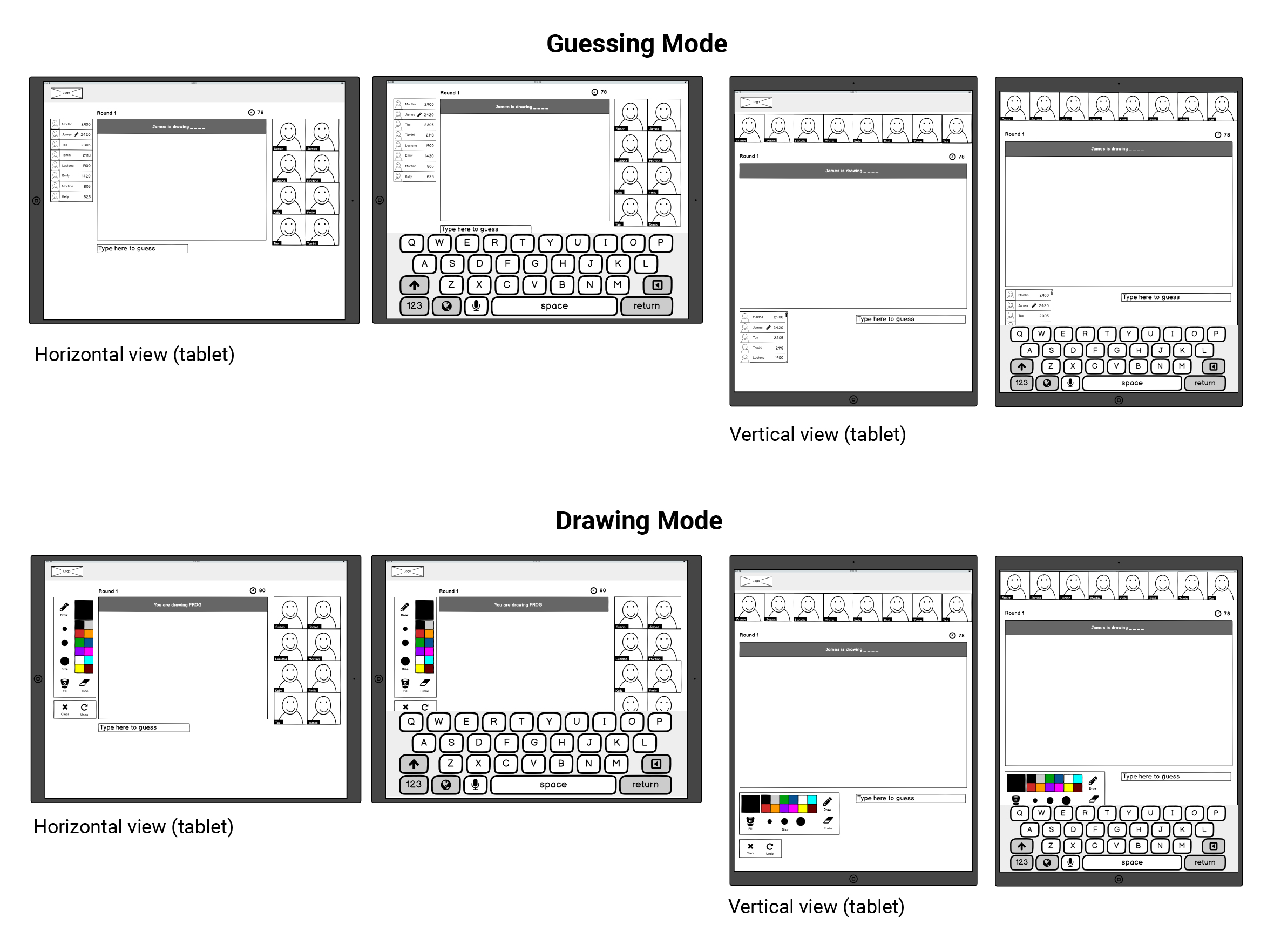
Keeping in mind the observations and notes from the user tests, I made some design decisions that I felt would be more usable for seniors. This included:
- Elimination of the chatbox: Seeing as videos will serve the function of conversation, I didn't feel that there was a need for a chat box. We also found that initially, users do not know where to type in their guesses. In this design, I eliminated the chat box completely and replaced it with a simple text area for users to enter their guesses.
- Location of the art palette: On Skribbl, the art palette is at the bottom of the screen so users had difficulty with locating it without guidance. I moved the palette to appear on the left of the art board, replacing the scoreboard.
- Appearance of a status bar: A new feature is the 'status bar' that appears at the top of the art board. This serves a few purposes. First, is to make the hints more obvious as users did not see the hint feature in Skribbl. Second, is to keep the user informed on who is drawing.
The low-fidelity mockups were created using Balsamiq. Knowing that seniors are more likely to use a tablet, I created four boards:
- Horizontal view for users who are guessing
- Vertical view for users who are guessing
- Horizontal view for users who are drawing
- Vertical view for users who are drawing
Each board has two screens, the second screen displays how the screen could look like with the keyboard activated (like how it would on a tablet).
Screenshots of the low-fidelity mockups
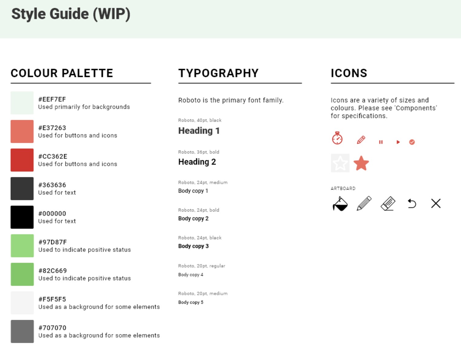
Style Guide
I also created a style guide, which evolved throughout the course of the project. View the full style guide here.
Interact with the prototype below or click here to view the Dashboard prototype on a different browser.
Reflection
Having parents who are not the most comfortable with technology, I had my fair share of teaching them to use their phones and computers. Many times this would involve trying to achieve a social purpose, for example, how to share a photo on Whatsapp to their group of friends.
Despite this, being able to firsthand see the challenges faced by seniors while playing pictionary was humbling and eye-opening. It made me realize how much I took for granted when it comes to digital literacy. This further fueled my motivation and goal to become an expert when it comes to accessibility and design.
In addition, as someone who isn't much of a gamer, I didn't realize all the little steps and intricacies that happens during a game, even for as something as 'simple' as pictionary. By putting myself in the shoes of the game designer, I came to appreciate and value the work that is done to design an immersive game experience.
Next Steps
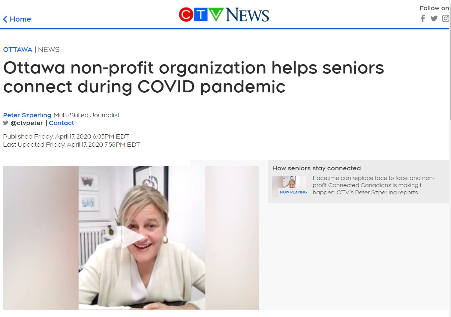
The game is currently under development. Further updates to the status of the game will be updated here. Meanwhile, our game has received some media interest back in April 2020, check it out.
Below is a testimonial provided by one of the founders of Connected Canadians:
"I had the pleasure of working with Kelly on a social gaming app designed for intergenerational engagement. Kelly proved to be a rock-star from the start and fully committed to the project. She was an active participant in all phases of the design journey from ideation to prototype development. Kelly is adept at modern design tools, good at building clean interfaces and intuitive workflows. She is always open to feedback and best of all she has a kind heart. She volunteered her skills to our non-profit project and went above and beyond."
- Tas Damen, Co-Founder and CIO of Connected Canadians
Featured Projects
Hi, my name is Kelly and I'm a UX/UI designer in Vancouver, Canada.
I advocate for users while helping organizations achieve their goals with strategic thinking.
Like what you see?
© Kelly Choi 2023


