Helping people learn to cook online with a professional chef
Case Study • Mobile App Design • UX/UI Design
The Problem
When you're learning to cook, the internet is usually your go-to source for recipes or cooking advice. However, it can get frustrating and time-consuming when:
- the recipe is poorly written
- you need to scroll through ads or irrelevant content to get to the recipe
- the recipe uses ingredients or tools that you don't have
- you have specific cooking questions but you can only find generic advice online
Sometimes you need more than just the internet as your friend. What if you can connect with an expert for advice at the moment you need it?
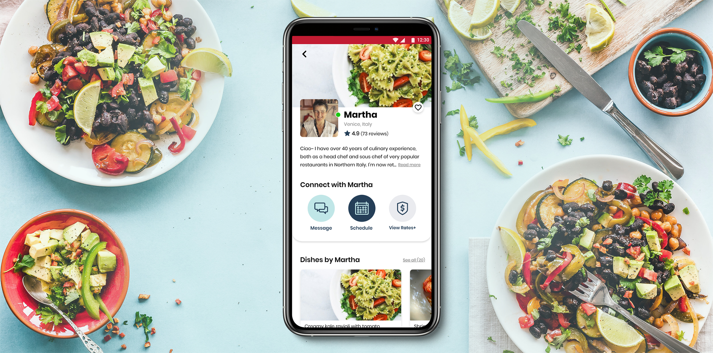
I took on the challenge to design a mobile app that can help users learn to cook online by connecting with a professional chef.
The Solution
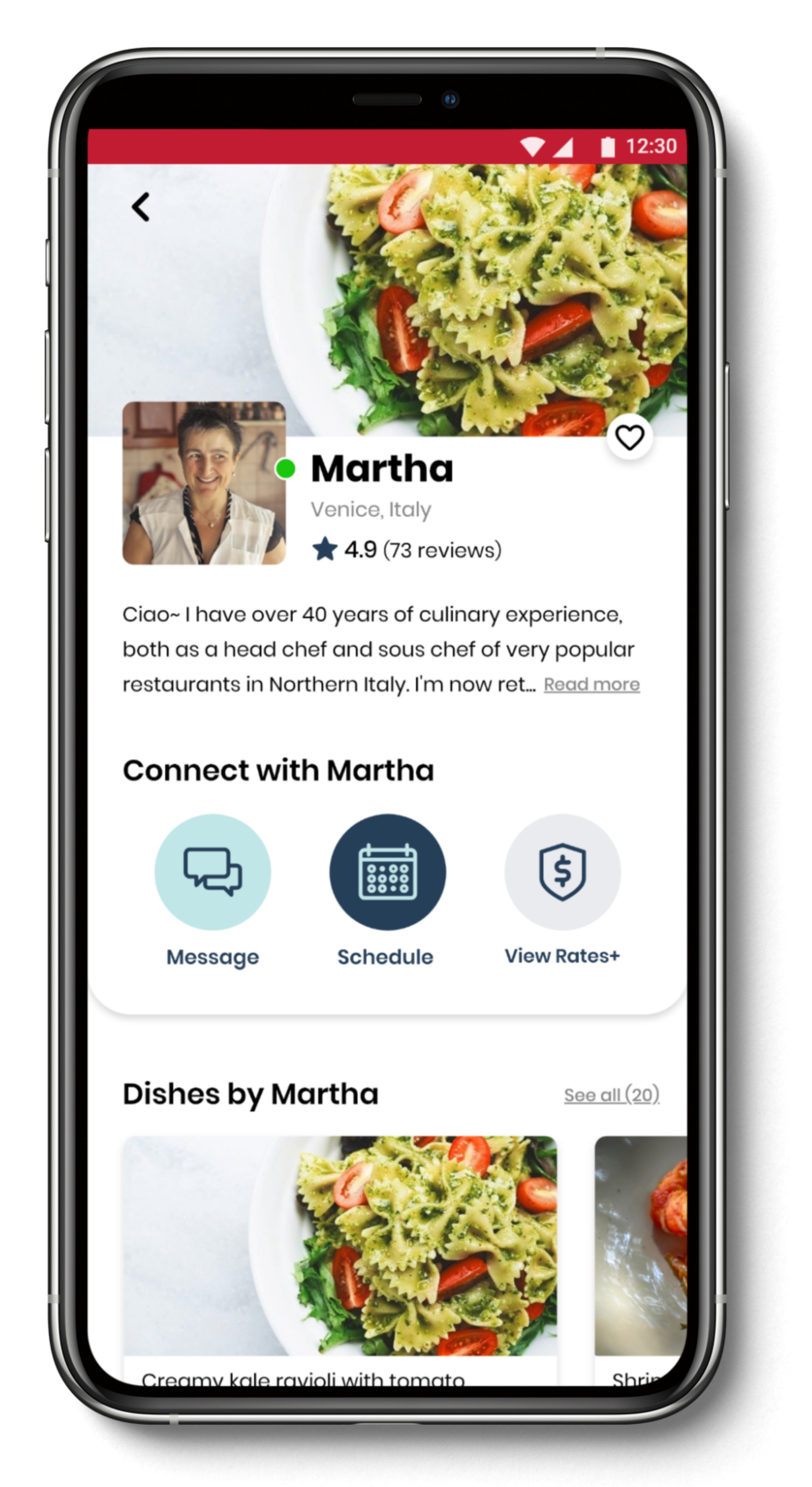
JustCookIt is an app that allows people to easily find and instantly connect with a professional chef to get advice for their cooking needs.
My role: UX/UI Designer
Tools: Adobe CC, OptimalSort, UsabilityHub
Timeframe: January - June 2020
Client: Course project for CareerFoundry
The Process
Step 1: Research
- User research
- Competitive research
Step 2: Analysis
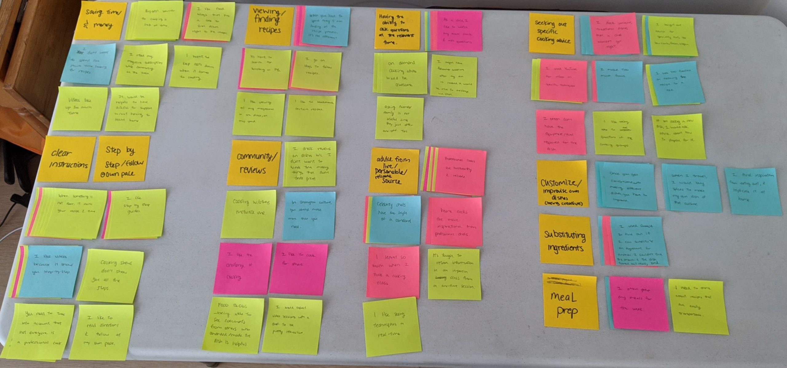
- Affinity map
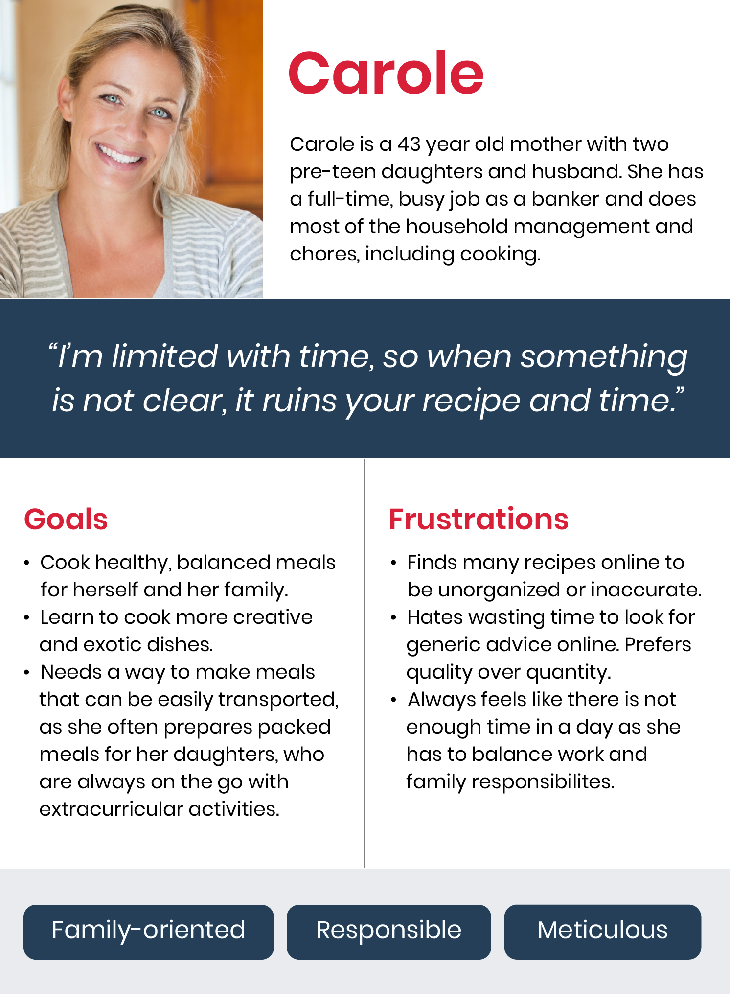
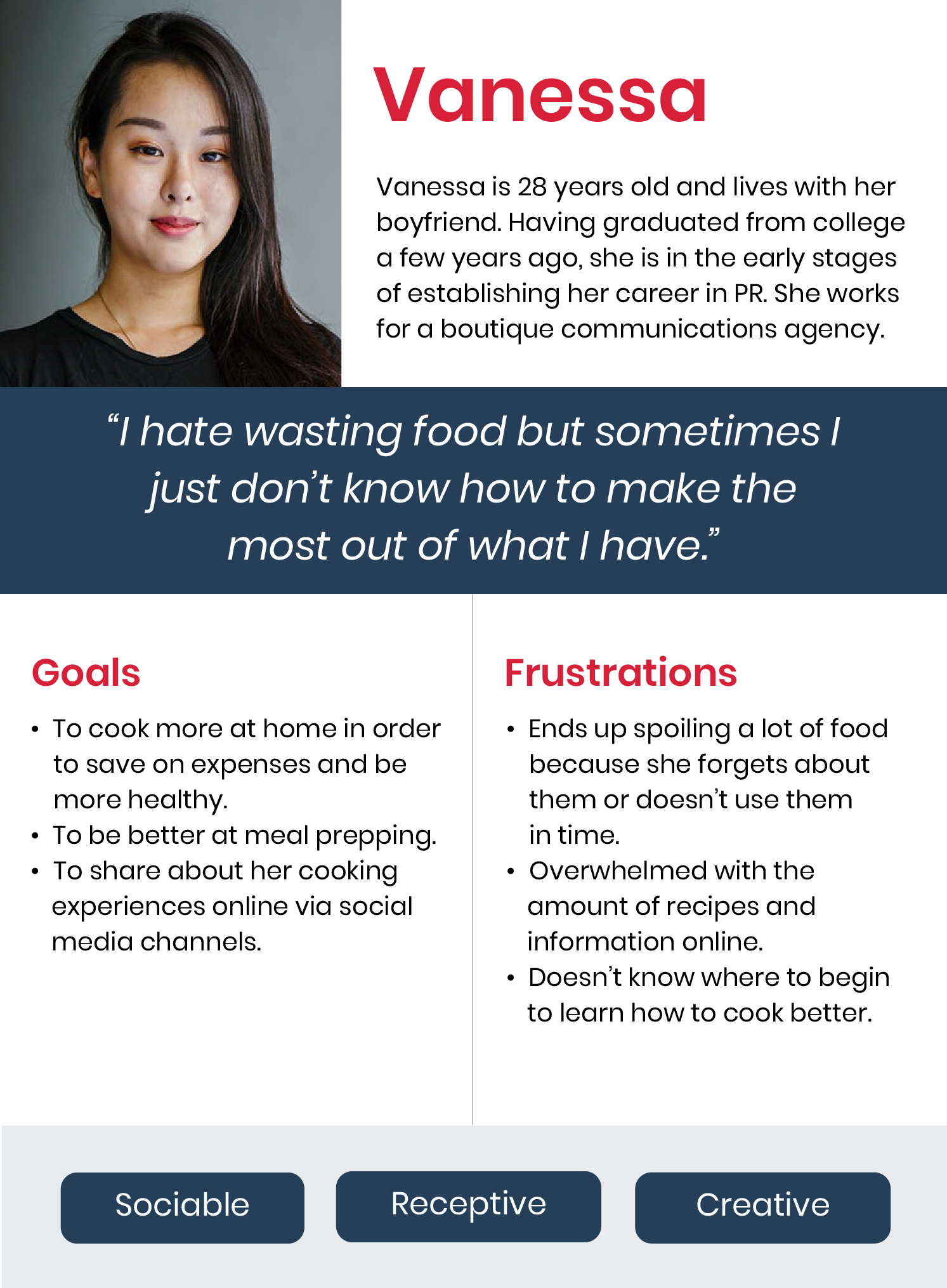
- Personas
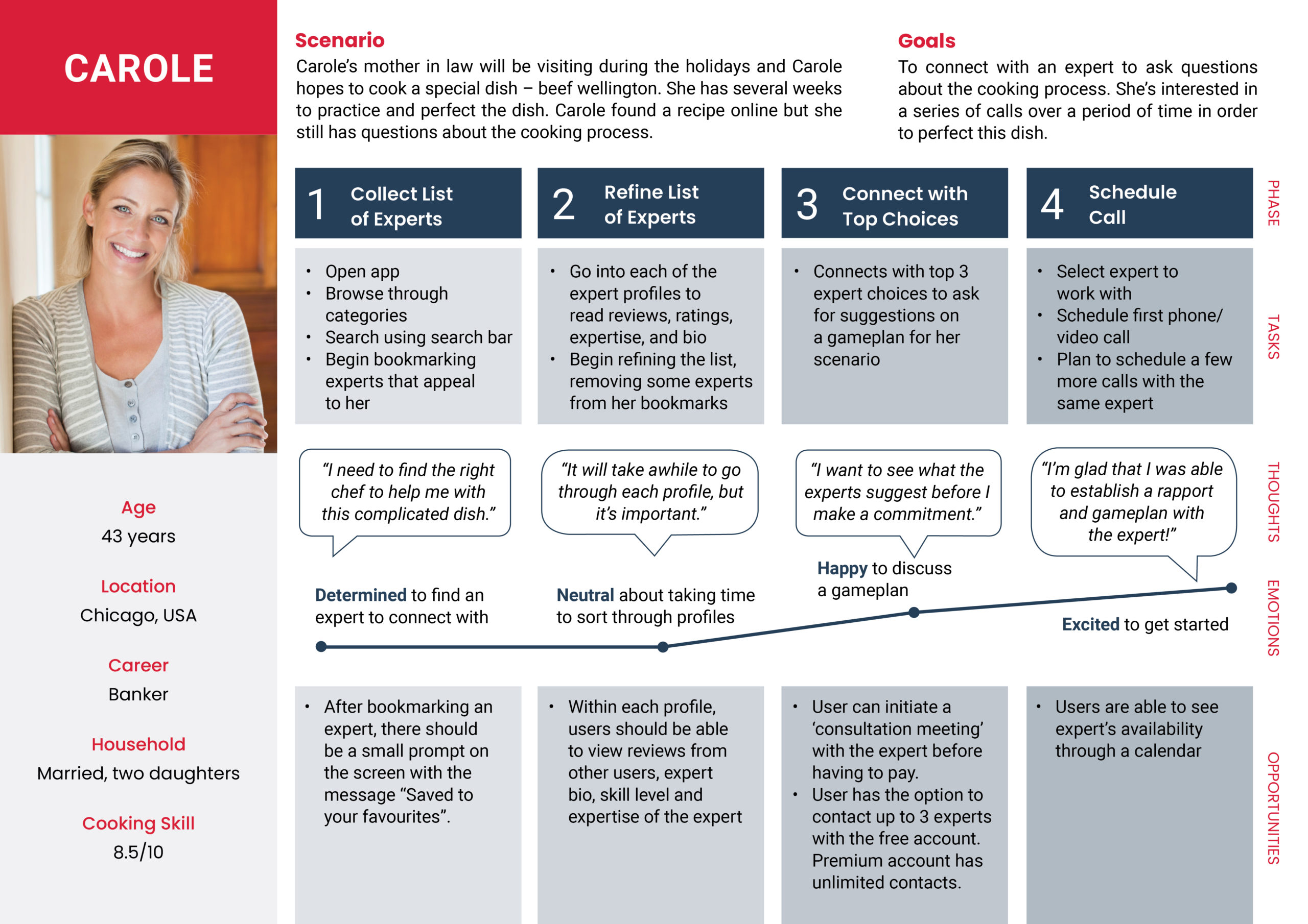
- User journey maps
- Information architecture
Step 3: Design
- Sketches
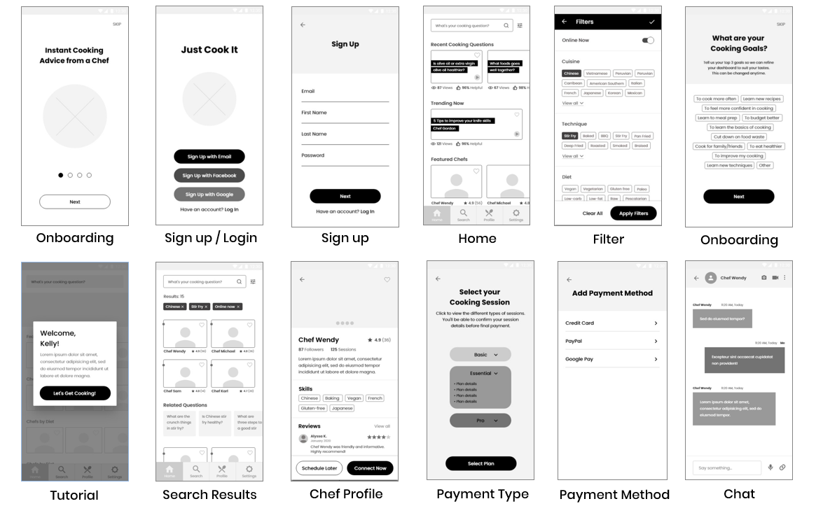
- Low-fidelity wireframes
- Mid-fidelity prototypes
- Style guide
Step 4: Test & Iterate
- Usability testing
- Peer review
- Designing for accessibility
My first step was to understand the scope of the problem. In order to do so, I needed to start talking to people. I decided to conduct a mix of research methods including user surveys, user interviews, and a contextual inquiry.
My goals were to:
- Understand behaviours and attitudes surrounding the activity of cooking.
- Find out the pain points and challenges that people face when cooking.
- Learn about any cooking tools people currently use and how effective they are.
User Surveys
x 2
User Interviews
x 4
Contextual Inquiry
x 1
80
participants
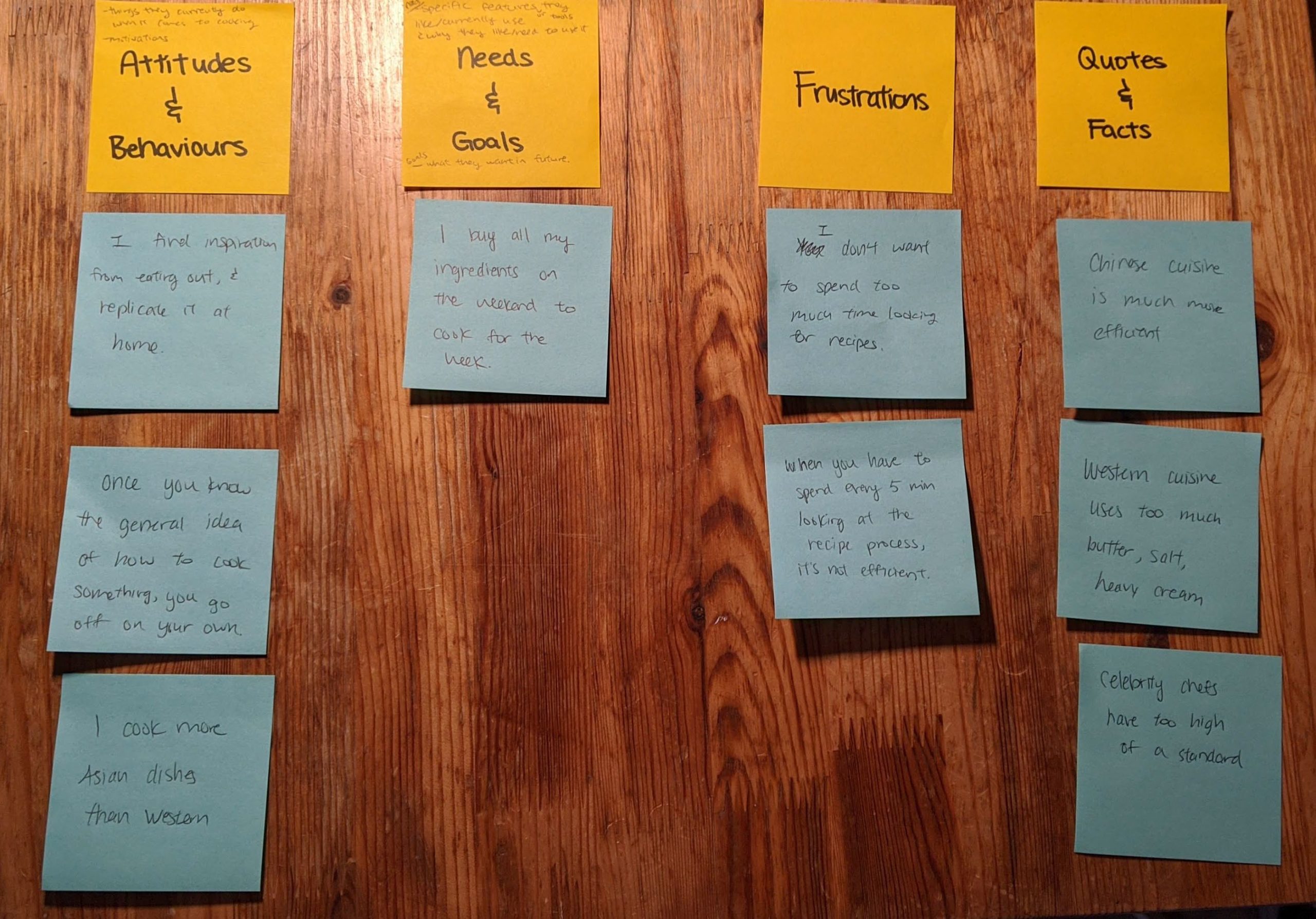
Some findings gathered from user research
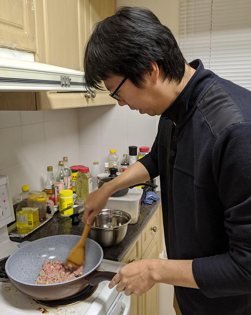
Observation of a participant cooking in his kitchen (contextual inquiry)
Competitor Research
I performed a competitor analysis to get a better understanding of what already exists in the industry. I looked for both online and offline competitors as well as direct and indirect competitors.
| Direct | Indirect | |
| Online |
|
|
| Offline |
|
|
*Note: this was added in late stages of the project so research is limited
SWOT Analysis
I decided to conduct a SWOT analysis on the online direct competitor, TalkToChef, since they are the biggest threat towards my app.

TalkToChef describes themselves as an “online and mobile platform where people get their everyday cooking questions answered in real-time by a culinary professional”.
| Strengths | Weaknesses |
|
|
| Opportunities | Threats |
|
|
Key Findings
- People want to cook more: Over 70% of participants said they want to cook more because they believe it is healthier, cheaper, and fun.
- Current food apps do not help with learning to cook: Over 80% said they have not used an app to help them with learning to cook. While there are many food-related apps that already exists, most are recipe sharing or nutritional apps.
- Virtual chefs are not common: When asked if they would consider connecting with a chef to help with cooking, only 24% said 'yes' while 48% said 'maybe'. Participants who said 'maybe' had concerns about how easy it would be to access and assumed that it would be costly.
- Lack of time is the biggest barrier to cooking: Time constraints was voted the number one reason that puts people off cooking. Also, the duration of the dish is the most common factor in when deciding what to cook.
- Professional chefs are intimidating: Many participants said that they found professional chefs (i.e. Gordon Ramsey) to have too high of a standard for cooking and prefer learning from 'home cooks', who are more relatable.
Insights were derived from the findings and potential solutions were derived from the insights. Below, I listed the top three insights.
Finding

Insight


Solution
| Finding | Insight | Solution |
| Online recipes contain too much clutter and are written in a confusing way. | People like clear, straightforward directions. | Searching for and connecting with a chef should be intuitive and easy. |
| Cooking shows go too fast. People prefer videos because they can pause and rewind. | People like to learn at their own pace. | Users can connect instantly with a chef through text, phone, or video chat at their own convenience and at the comfort of their own home. |
| People like to interact with a real chef during cooking classes but do not feel that one-time classes are enough to retain information. | People find that a personalized approach is helpful when learning to cook. | Chefs are able to give relevant advice that pertains to the user's skill level, needs, and what the user has in their kitchen. |
You can view the full list of affinity map insights in this PDF document.
Personas
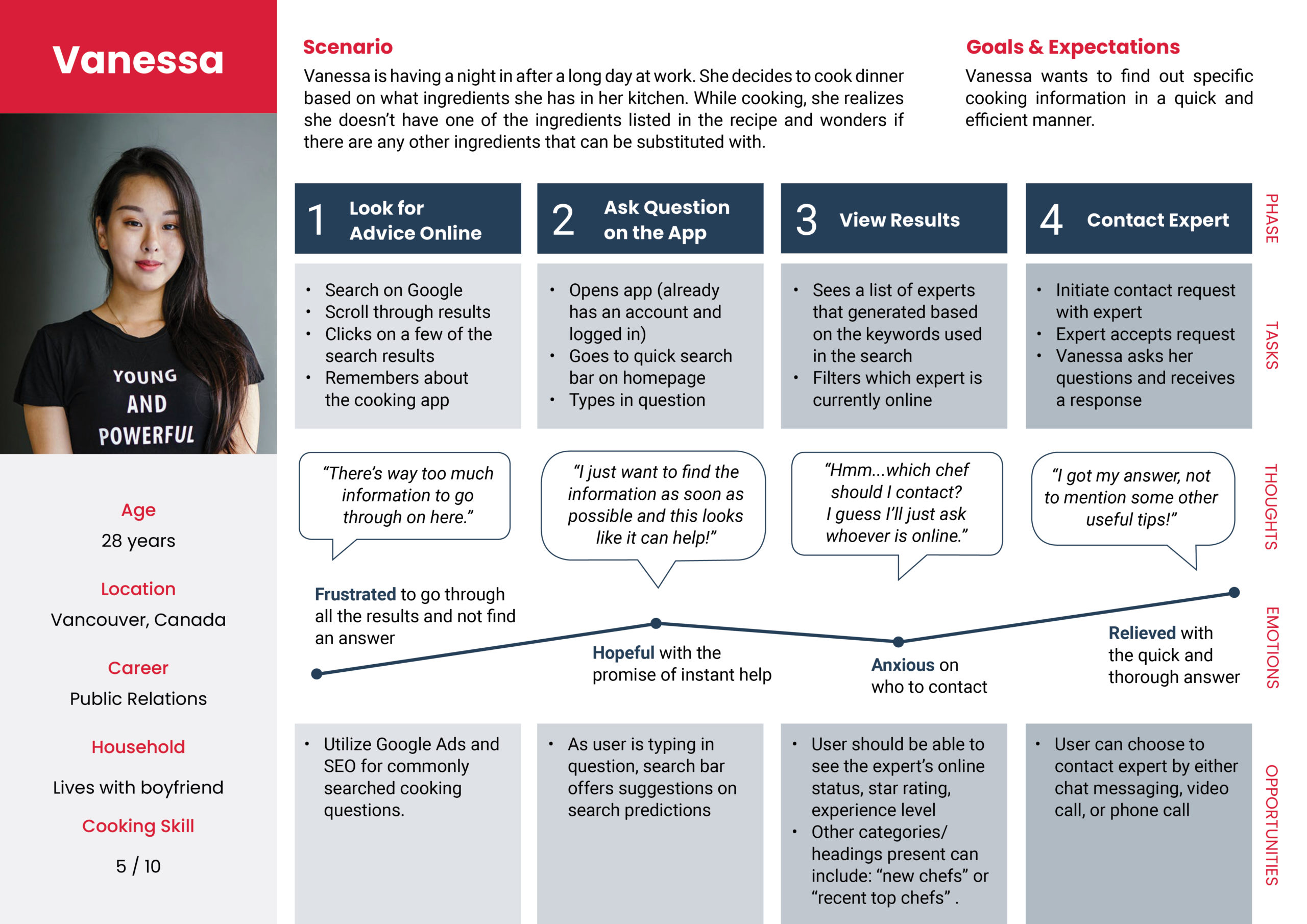
Using the insights, I created two primary personas to base my design on. The mindset of the target audience should be someone who enjoys cooking and/or wants to improve their cooking skills. The two personas were kept in mind throughout the rest of the project.
User Journey Maps
To empathize with the personas, I created user journey maps. While putting myself in the shoes of the persona, I also visualize the goals they would have in the app and the steps they would take to reach their goals.
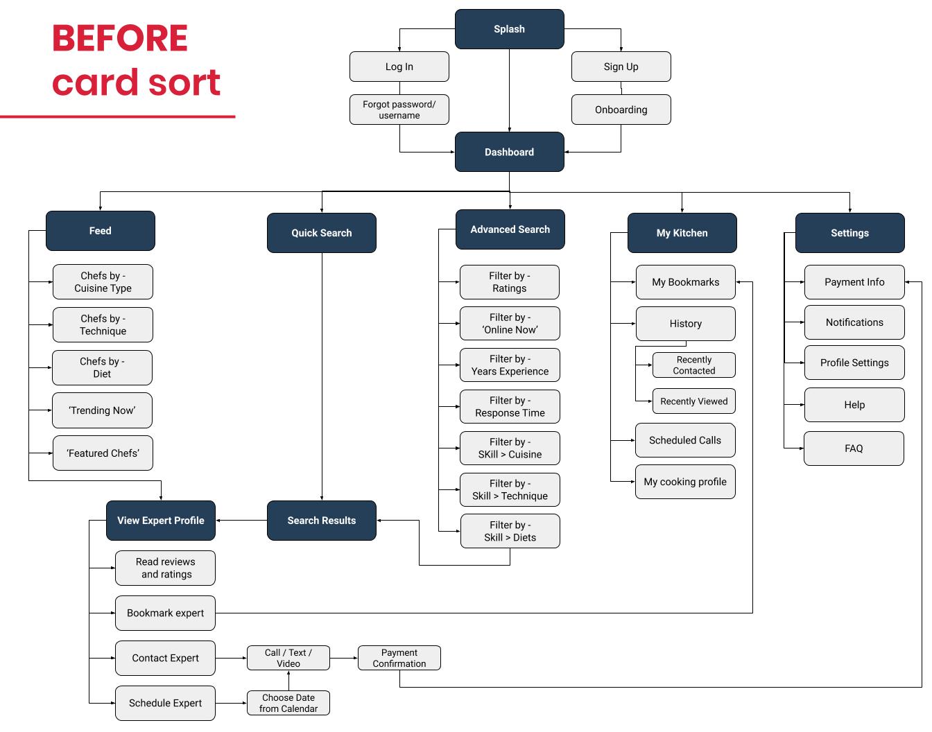
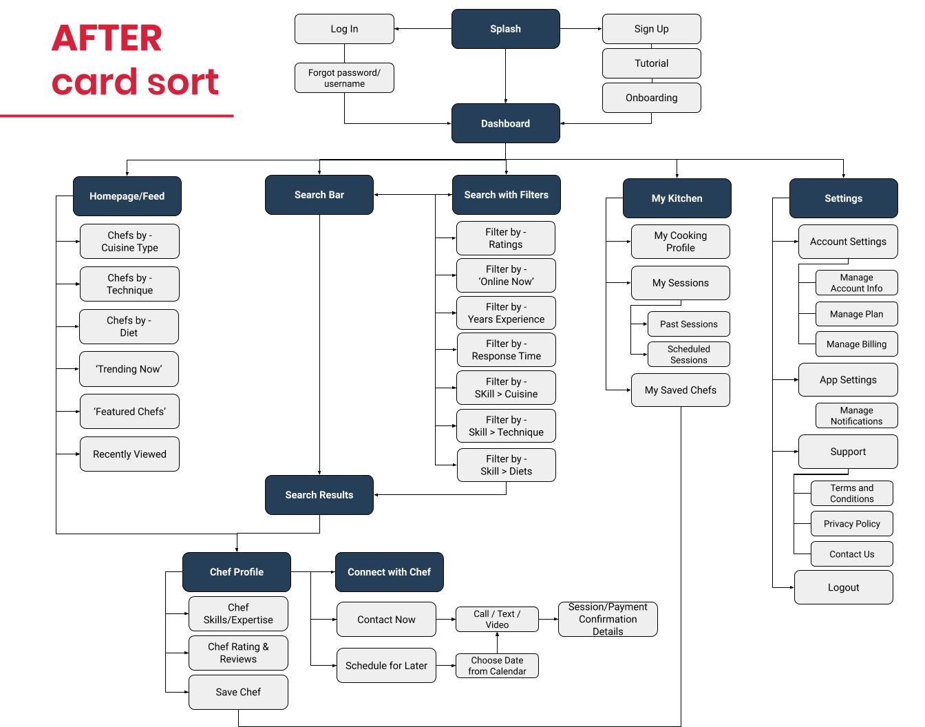
Information Architecture
Using the personas and user journey maps, I was able to draft an initial sitemap on what type of information would be available on my app and how it could be organized. To validate the sitemap, I conducted a card sorting exercise using OptimalSort.
A total of 7 participants completed the card sorting exercise. This exercise gave me further insights on what changes I should make to the sitemap.
Key Findings
- The top insight that I received is that people want clear instructions when cooking. It sounds so simple but it can be very easy to overcomplicate things. So I knew I had to dedicate some time in the design phase to the two most important user flows, which are searching for a chef and connecting with a chef.
- Two personas were created based on my findings from the research and analysis phases. There's Carole, the working mom, and Vanessa, the millennial who just started her career. They are similar in that they both enjoy cooking and want to eat healthy and they are different in that they have different cooking aptitudes and goals.
- It was important that I kept in mind that although the purpose of the app is to help people learn to cook, not everyone who uses the app is new to cooking.
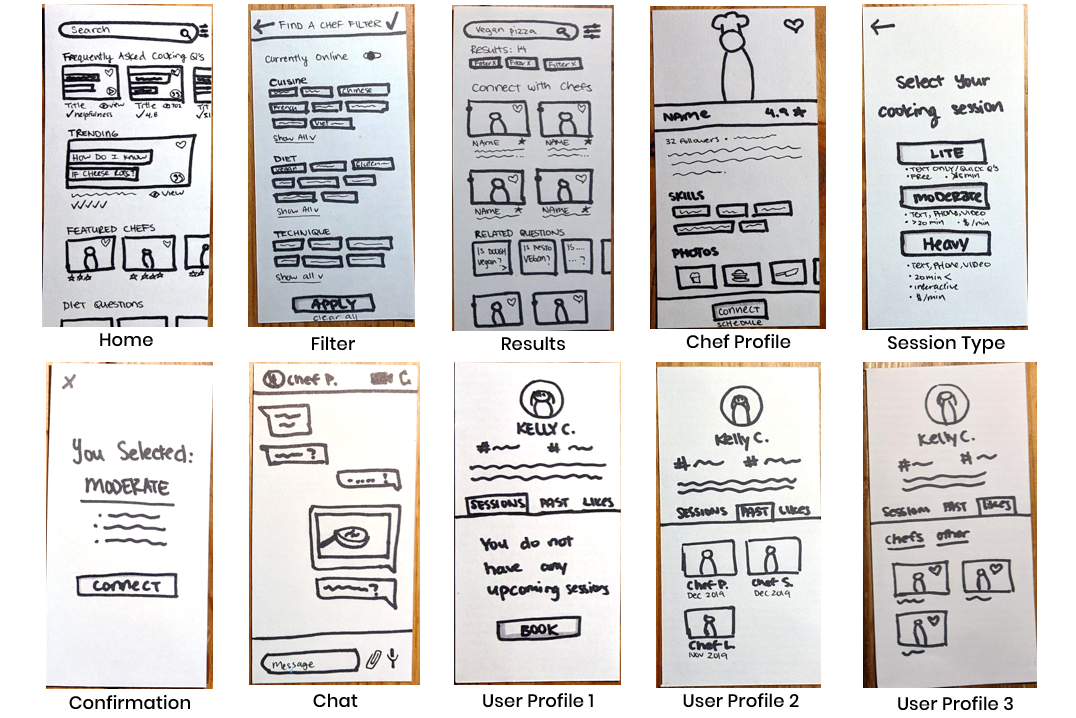
Sketches
I started with some quick sketching to generate and gather my initial thoughts and ideas. These were ambiguous, messy, and quick. Below are some samples of the many sketches I did.
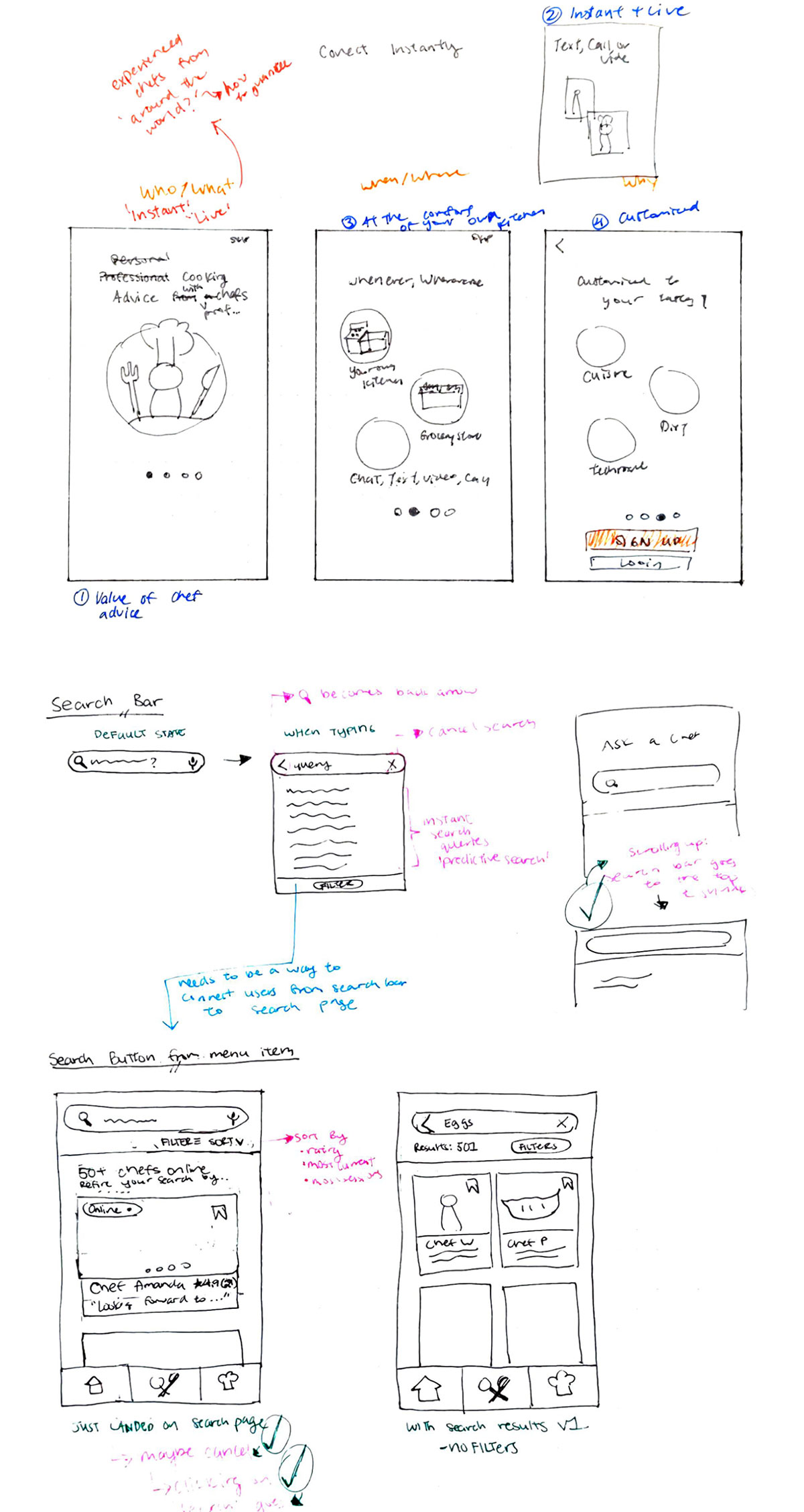
Low-Fidelity Wireframes
I began the design process by sketching low-fidelity wireframes using a marker and paper.
Mid-Fidelity Prototype
I then created mid-fidelity mockups with Adobe XD. I kept the colours on a greyscale scheme and used the prototype feature on Adobe XD to create the interactions between screens.
Style Guide
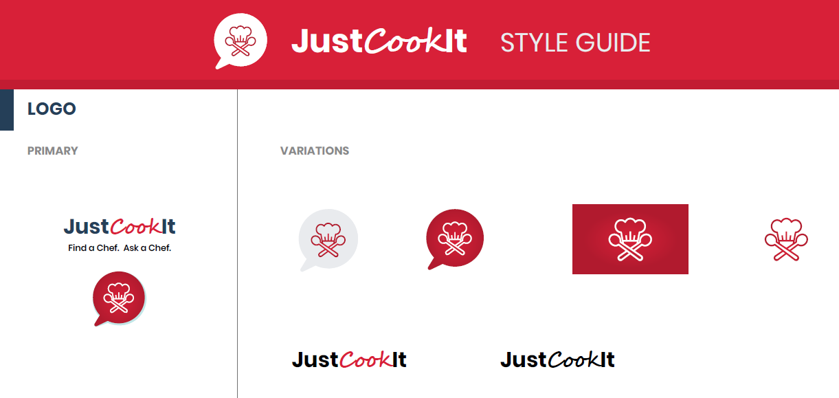
Throughout the course of the project, the visual elements of my app evolved. To ensure that I capture the latest updates and to achieve visual consistency, I created a style guide.
I conducted two moderated remote tests and four moderated in-person tests on a total of six participants between the ages of 28 to 45.
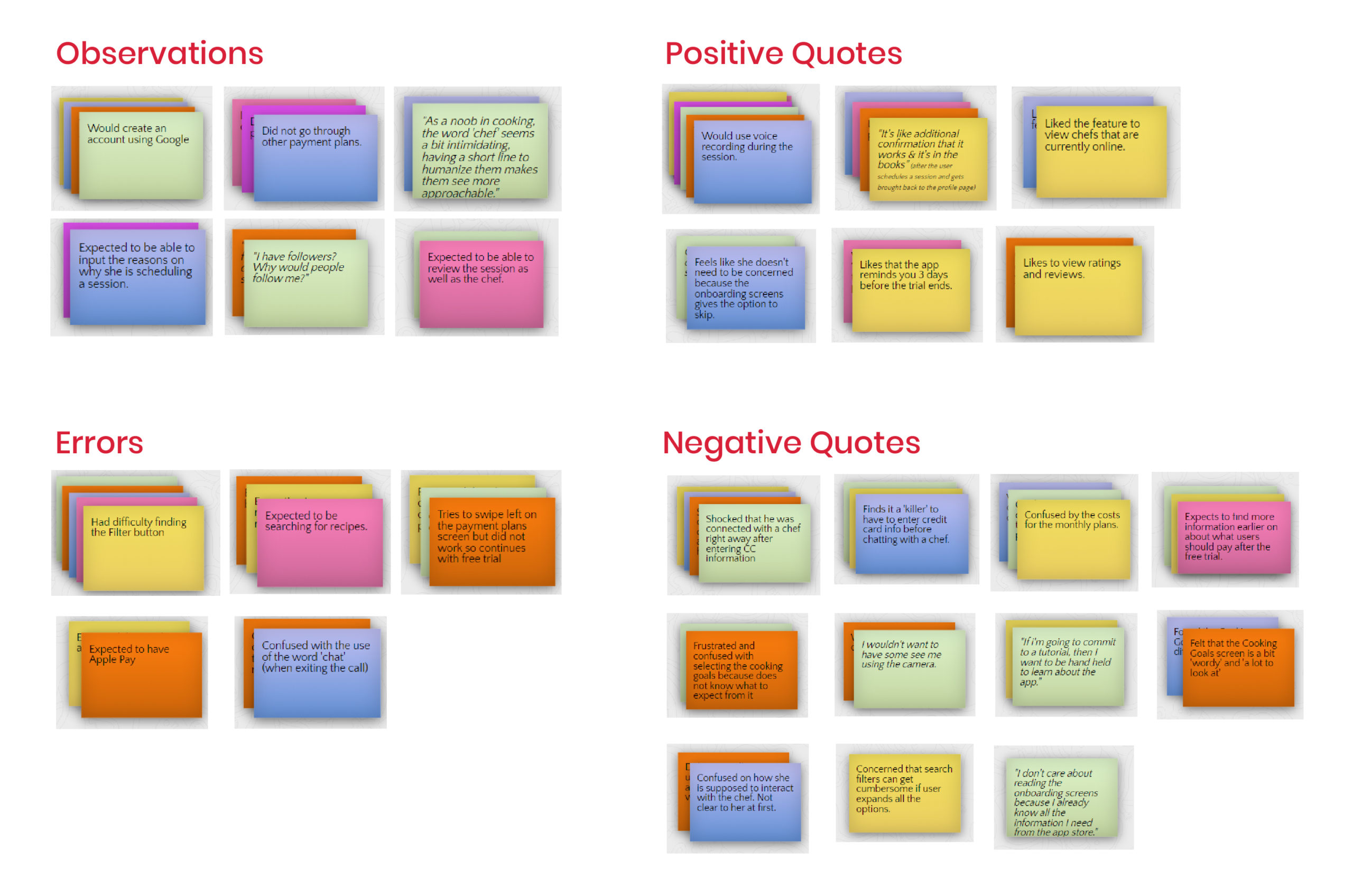
Affinity Mapping
Rainbow Spreadsheet
With the insights sorted, I then used a rainbow spreadsheet to get a high-level view of all the information. This was also helpful in identifying patterns and prioritizing observations and errors.
Usability Test Results & Changes
Using the insights from the affinity map and rainbow spreadsheet, I prioritized three issues to be fixed in the next design iteration.
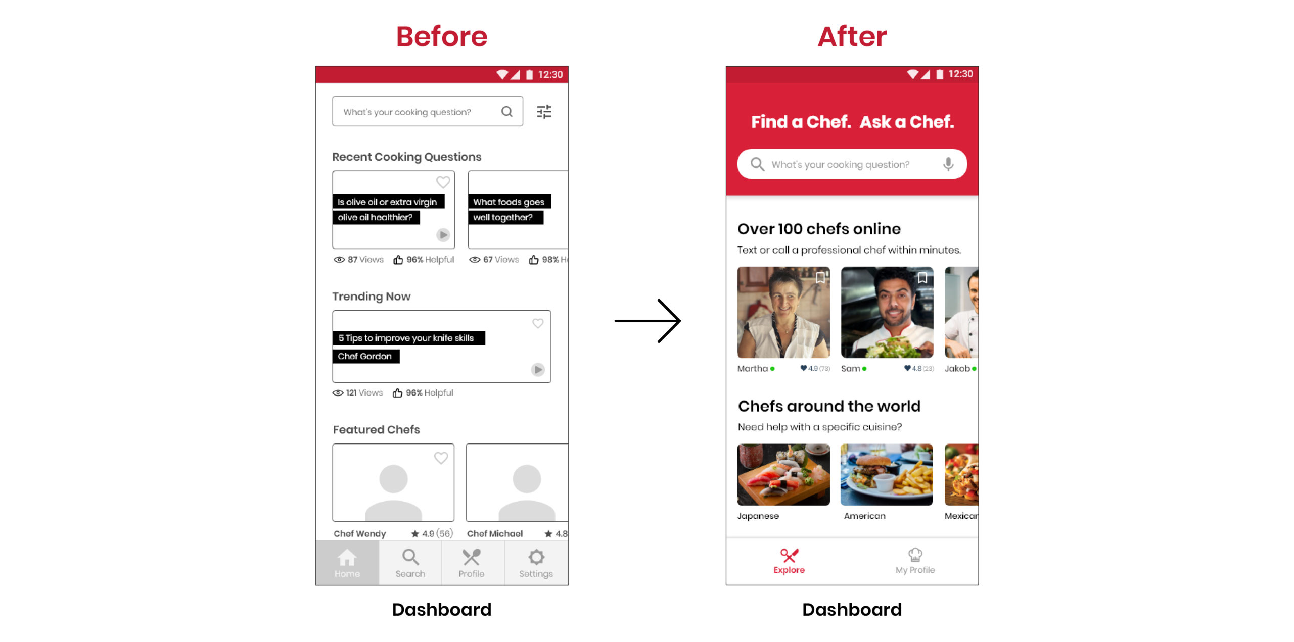
Issue 1: Participants expected to find recipes rather than chefs
50% of participants expected to find recipes and were surprised that they could connect with a chef.
"I'm expecting to see a bunch of recipes...so is this app supposed to help me find chefs?"
"I wasn't sure whether I'm asking chefs advice or am I finding recipes. I'm confused about that."
Changes:
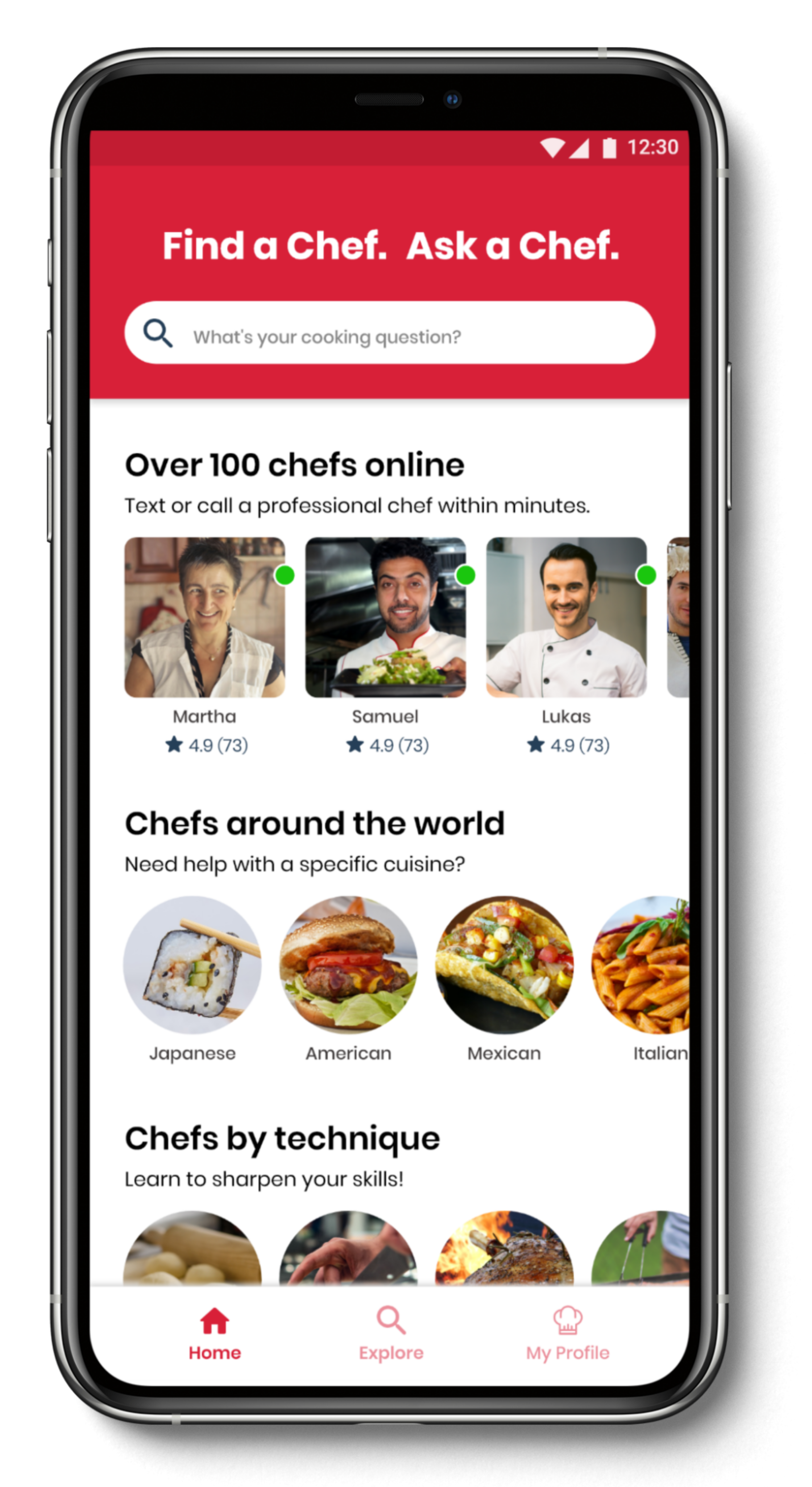
- Revised content on homepage to ensure that the app concept is clear and puts more emphasis on finding a chef.
- Added the heading 'Find a Chef. Ask a Chef.' for a clear and prominent CTA.
- Added 'chef-centric' headings such as: 'Over 100 chefs online' or 'Chefs around the world'.
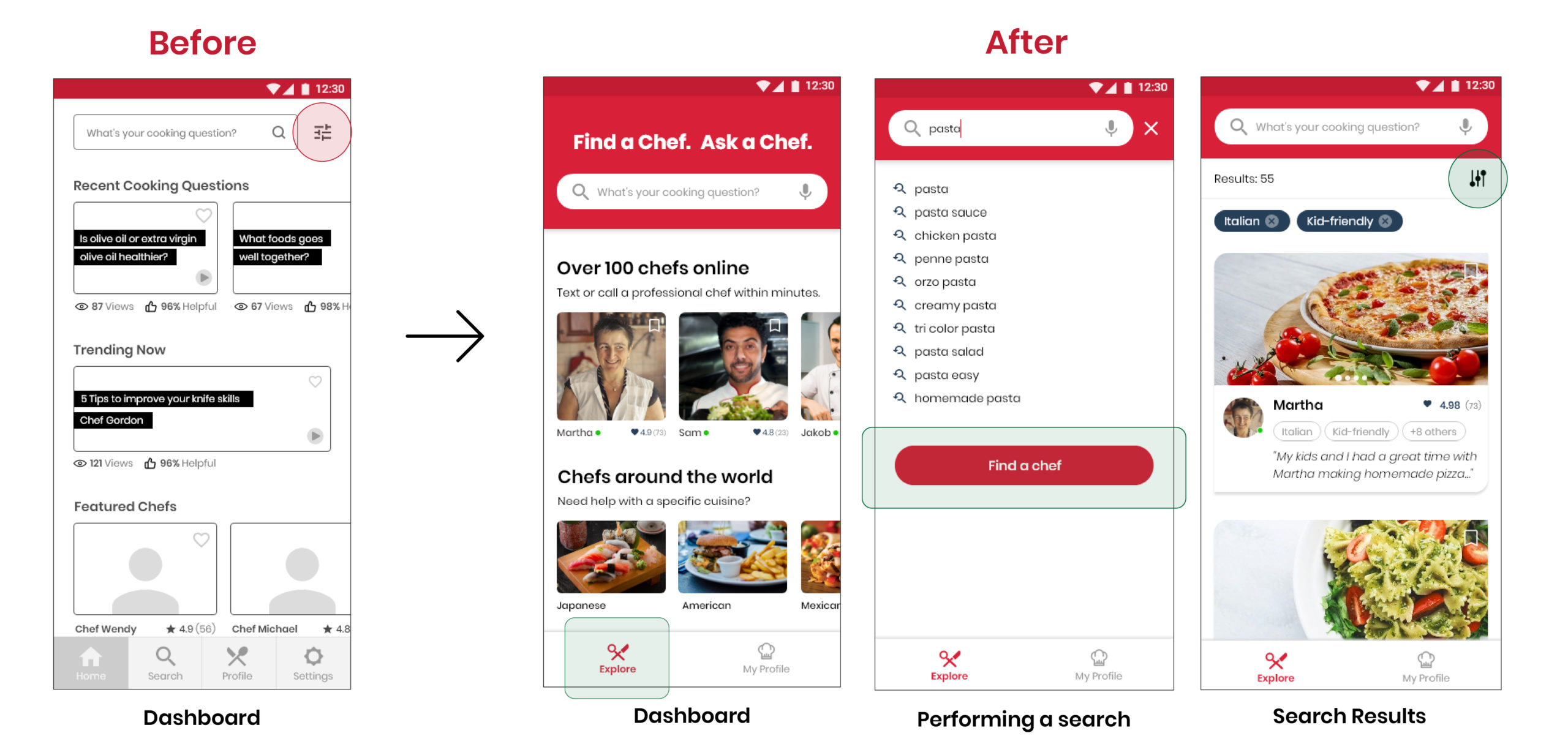
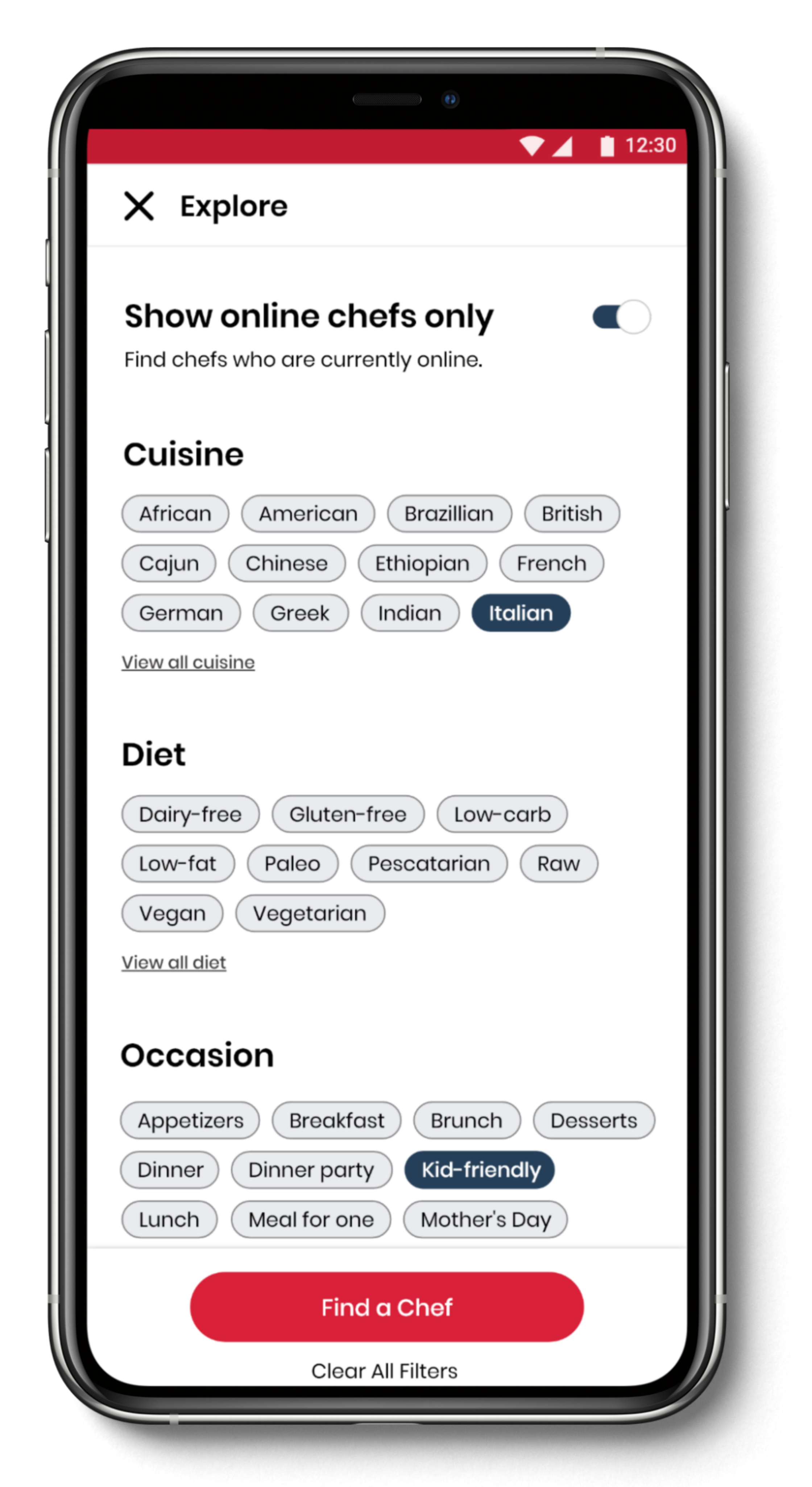
"I got confused between the search and search filters."
Changes:
Instead of only relying on one button on one screen (indicated by red circle in 'before' screen) to go to the Search Filter, there are now multiple ways for the user to access it:
- From the dashboard: by clicking on the 'Explore' button on the menu bar
- From the search page: clicking on the search bar and typing in a search query will display the 'Find a Chef' button (indicated by green box in 'performing a search' screen)
- From the search results: users can adjust their search filters by clicking on the search filter button (indicated by green box in 'search results' screen)
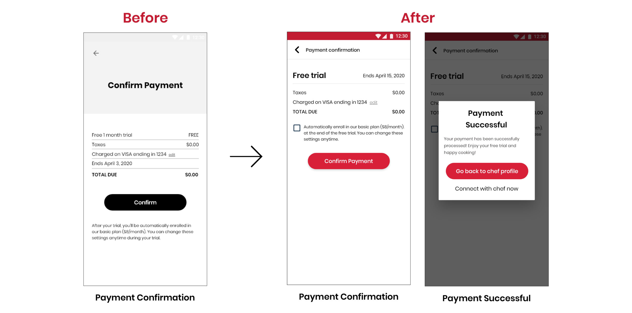
Issue 3: Participants were shocked to be connected to a chef so quickly after entering their payment details
67% of participants were shocked that their session began immediately as they expected to be brought back to the chef profile screen before connecting. A participant commented that having to enter her payment details acted like a ‘distraction’ so she almost forgot about connecting with a chef.
"I'm a bit surprised that it went directly into the convo without warning me..."
"I thought there would be a confirmation that says my credit card is saved...it caught me off guard..."
Peer Review
To get feedback on the latest iteration, I sent out a request for peer reviews via various online design communities and received 94 comments from 9 participants. By this point, I began my next set of tests using high-fidelity prototypes.
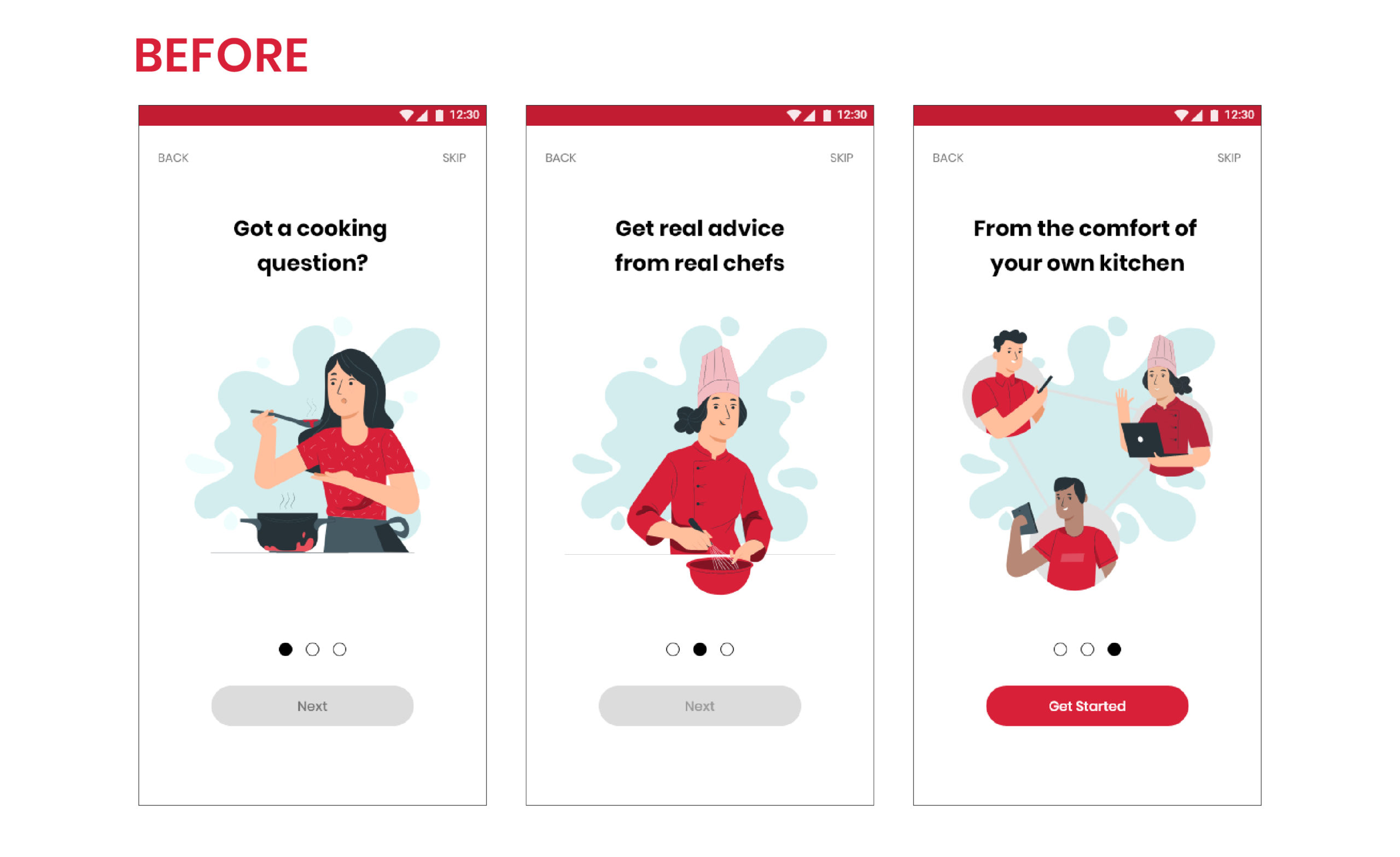
Onboarding images didn't make sense
Comments:
"Got a cooking question' Just this information on its own sound incomplete to me. As a user, I want answers to my questions."
"The last two slides aren't very instructional, more like an advertisement than directions on how to use the app."
Changes:
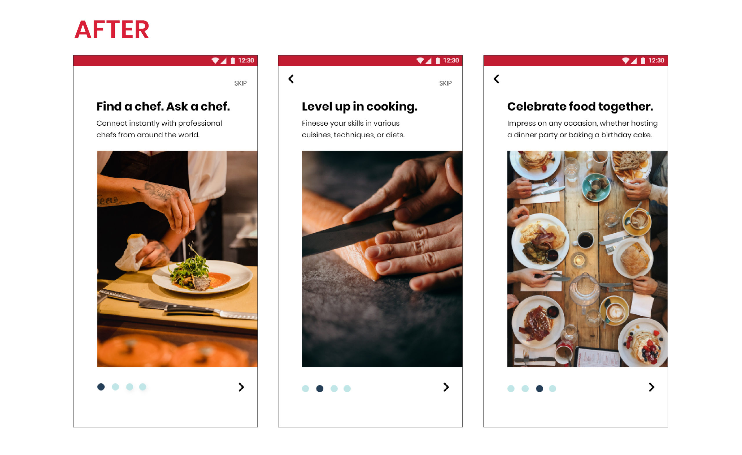
- I decided to take a different direction with the imagery. Instead of using illustrations, I used strong photographs that focuses on the hands of a person, whether they are cooking or eating.
- I also changed the heading and added additional subtext to each heading.
- UI changes have also been made.
Account verification process is confusing
Comments:
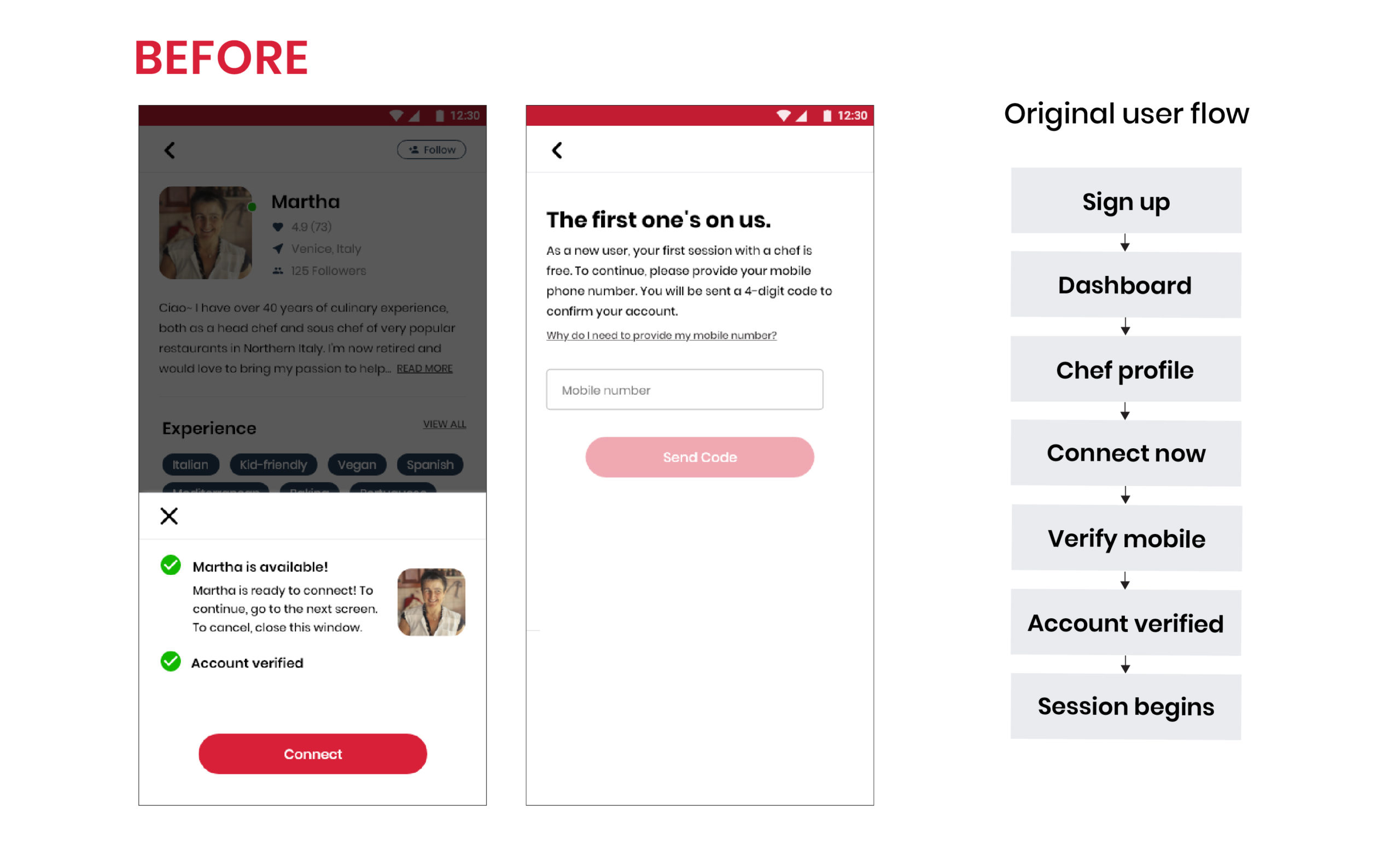
"I feel that the verification flow is a bit cumbersome. I would rather verify everything and then do the call."
"Is it possible to verify the account earlier? What if the verification does not work or by the time the account is verified the chef is offline?"
"Are we able to verify the account beforehand?"
"Would the chef wait for me to verify my account?"
Changes:
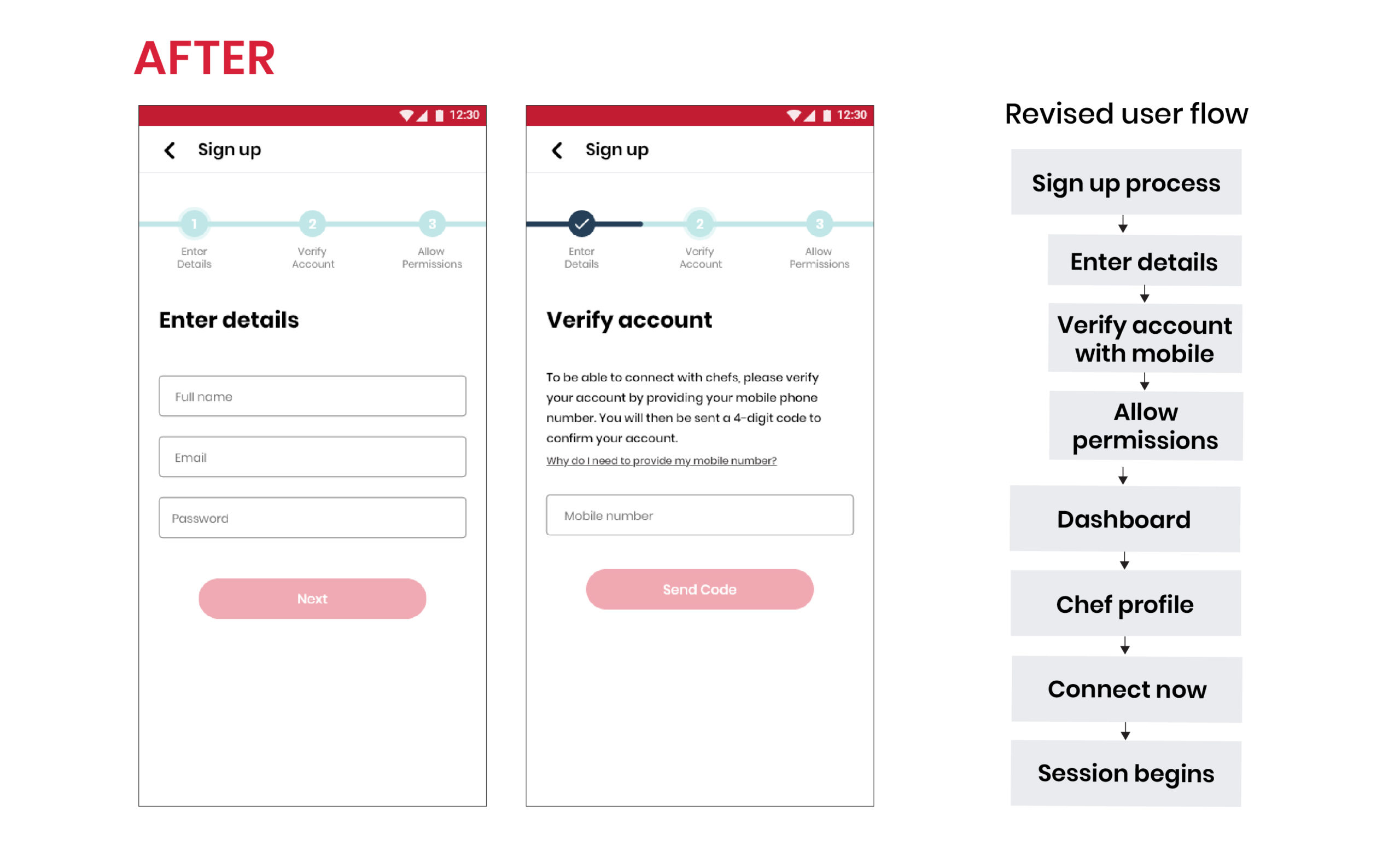
- I revised the user flow so the account verification happens in the very beginning during the Sign Up process.
- As part of this change, the sign upprocess now has 3 steps, indicated to the user by a progression bar.
Designing for Accessibility
Lastly, I wanted to see how I can make the app more accessible for people with disabilities. Walking through the app, I looked for issues that violates common accessibility guidelines and compiled them into an Accessibility Issues Chart. Below are a few of the accessibility design changes.
Form fields lack contrast & has unnecessary movement
Impairments affected: cognitive, visual, or users who are older and not tech-savvy.
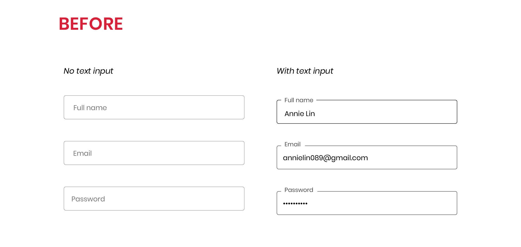
Before:
- The placeholder text moves when the text field is clicked on. This movement may confuse users with cognitive impairments.
- The lack of contrast between the background of the form field and the background of the screen may not be distinguished enough for users who are visually impaired.
- There is no visual cues to indicate if a text field was successfully entered.
- Cannot view password to check if it has been entered correctly.
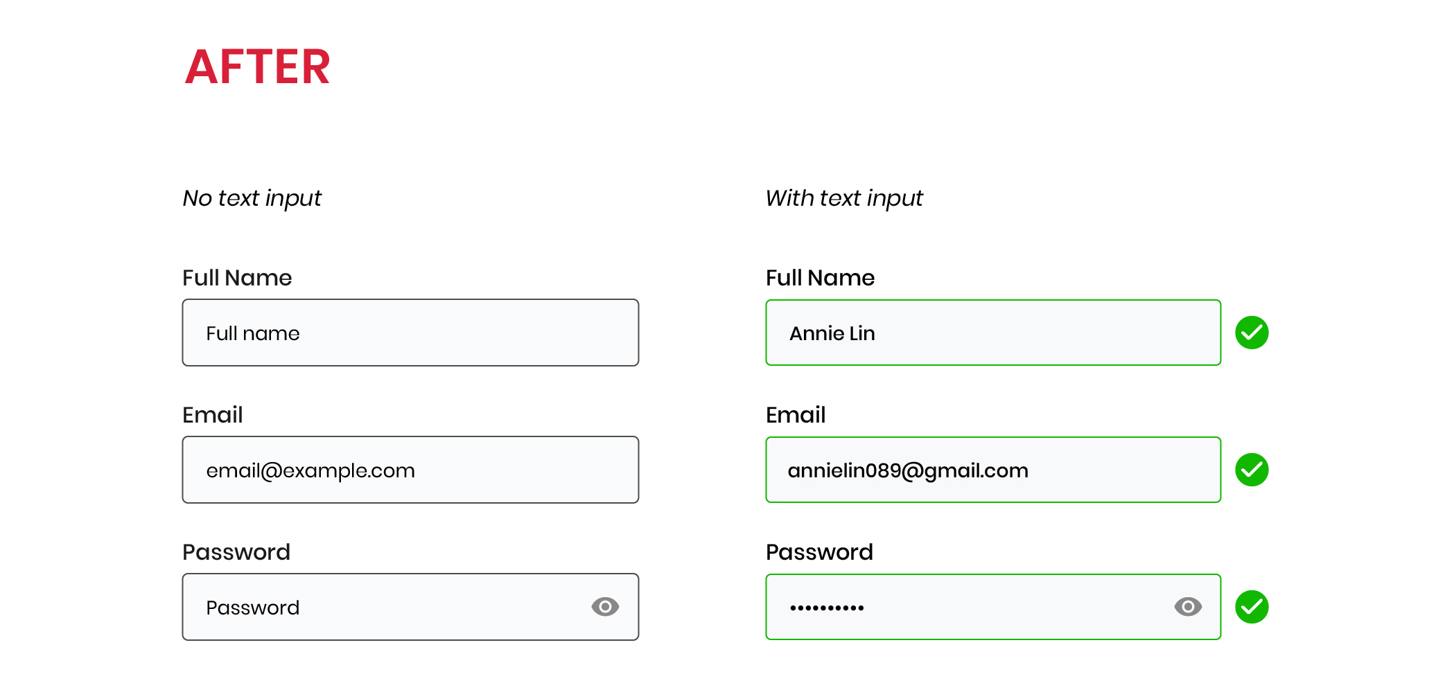
After:
- Added form label permanent on top of form fields
- Added light grey background to the form field
- Increased border thickness of form field
- Use of icons to indicate successful state
- Added ‘view password’ eye icon for users to view entered password
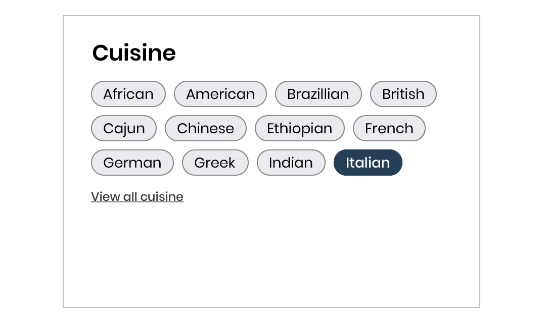
Filter tags are overwhelming
Impairments affected: visual
Before:
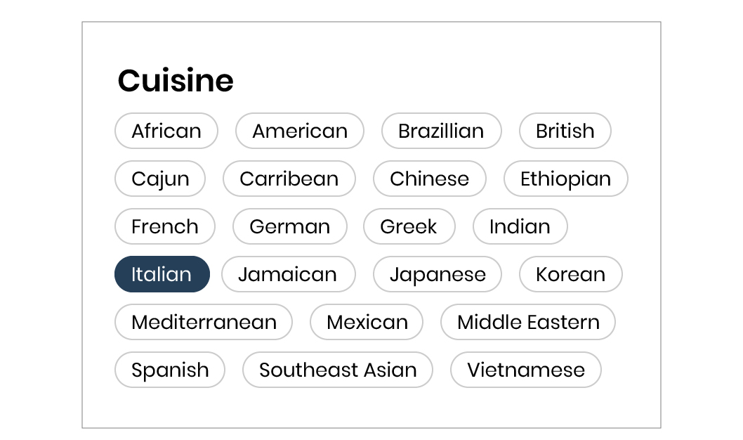
- The lack of contrast between the background of the filter tags and the screen may not be distinguished enough for users who are visually impaired.
- There are too many tags on the screen which can be overwhelming.
After:
- Added a light grey colour for the background of the filter tags.
- Changed to a darker border around the filter tags.
- Decreased the number of tags to 3 rows and added a 'view all' button that expands.
Key Findings
- An issue that I've encountered throughout this project was that people kept associating my app with a recipe app. I needed to make it obvious that the main purpose of JustCookIt is to find and connect with chefs. I did that by applying my copywriting skills to create clear, prominent headings.
- The design of my initial forms were not accessible. This was problematic as users had to access the forms to perform important tasks. With a few quick changes to the UI, I was already able to make the forms more accessible.
Final Prototype
JustCookIt is an app that allows people to easily find and instantly connect with a professional chef to get advice for their cooking needs.
Reflection
Think more like a designer and less like a marketer: In my previous career in marketing, I focused more on the ‘what’ and ‘how’ than the ‘why’. As I was always focused on the client or company’s needs, I often thought one step ahead on how I can achieve specific goals by a certain date.
When I created my initial user surveys, I had preconceived notions of what type of results I should get in order for me to move forward with this project. So when I found out that only 24% of participants would consider using a professional chef for advice, I started to feel discouraged and anxious.
Let the research drive the design: I felt like the research I did was a complete waste of time and that my idea wasn’t good enough. I began to impulsively brainstorm other ideas that I feel like would get more positive feedback. I later realized that I wasn’t letting the results of my research drive my designs. And to do so, I needed to let go of any preconceived notions.
Making insights out of all feedback: If I only let positive feedback drive my designs, then that wouldn’t be very realistic. Instead, I should take all feedback as important insights, and focus on how to make the most out of these insights.
After analyzing the results of the survey more carefully, I decided to focus my efforts on the largest portion of the answers - the 48% of participants who said 'maybe' to contacting a professional chef for help. As it turns out, the participants replied 'maybe' because they had their own assumptions or concerns about contacting a professional chef which has more to do with being unfamiliar with the idea of a 'virtual chef' than the app itself.
Next Steps
Improving accessibility: JustCookIt is created for people who want to improve their cooking skills so it is important that my app is accessible for anyone who uses it. While I made some steps to improve the accessibility, I know that much more can still be done.
Collaborating with chefs: Up to this point, I have only focused on users and their needs. However, without the chefs, this app would not work. If I were to continue with this project, I would start conversations with chefs to determine what their needs are.
Diversity and Inclusion: During the user survey, some participants said they cooked ethnic dishes which are less popular so it can be difficult to find resources. As food and cooking encompasses such a diverse range of cuisines and cultures, I would like for my app to reflect that as well. Some ideas to start with could be implementing multiple language support or collaborating with chefs of different backgrounds.
Featured Projects
Hi, my name is Kelly and I'm a UX/UI designer in Vancouver, Canada.
I advocate for users while helping organizations achieve their goals with strategic thinking.
Like what you see?
© Kelly Choi 2023

